In my earlier discussion comparing the Stephen Gray Stickley book and exhibition to the Doctors Barnes and Cunningham Rohlfs book and exhibition, I promised to expand upon my observations about the doctors’ version of Rohlfs after I saw their exhibition. A neater segue than the installation at the Carnegie Museum of Art could not be found. Carnegie’s Alan G. and Jane A. Lehman Curator of Decorative Arts Jason Busch was assistant curator of American decorative arts at the Wadsworth Atheneum Museum of Art in Hartford, Connecticut, which hosted the Gray Stickley show so reviled by the doctors.
For now, paintings and sculpture are taking a back seat at the Carnegie Museum, where the Rohlfs show was paired with a “complementary” tapestry show in the temporary exhibit galleries and a new installation of decorative arts called “The Art of Daily Life” is in the Ailsa Mellon Bruce Galleries.
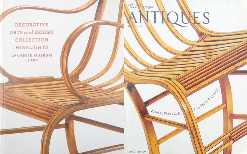
Were it not for vagaries of fashion in collecting and gallery installation Charles Rohlfs and Samuel Gragg would never have made it into the hallowed halls of art museums. After the curvy lines of a Gragg chair were used for the cover of The Magazine Antiques, the Hirschl & Adler Gallery featured an example with arms in one of their lavish displays at a major antiques show. Now that armchair is featured in Carnegie’s Bruce Galleries and on the cover of their handbook, which is strikingly similar to the Antiques cover.

Carnegie curators have produced a “handbook” to help merchandise their most prized acquisitions, which spill out of the Bruce Galleries into the Scaife Galleries and beyond to any suitable nook or cranny. While the decorative art objects exhibited could never be a part of the daily life you and I know—Ailsa Mellon Bruce’s Meissen Swan porcelain was made for a minister of the elector of Saxony Augustus the Great and one cannot sit upon Gaetano Pesce’s squishy Pratt Chair—the concept of elevating the tools used in the act of day-to-day living as well as how one’s life was lived to the level of “fine art” was central to the Arts and Crafts movement, where Rohlfs now has a home. William Morris famously pontificated: “Have nothing in your house that you do not know to be useful, or believe to be beautiful.”
This focus on decorative art can be seen as an extension of an attitude established by Pittsburgh’s famous native son, who changed the way we look at the objects of daily life (Brillo boxes and Campbell’s soup cans) by presenting them as art. The handbook text, which accompanies gorgeous photographs, adds another alliteration to the charmingly nonsensical museum publicity quote above: “Where spin meets scholarship.” When I carped about misleading statements in the new guide, I was admonished to acknowledge the differences between a “handbook” and a “catalogue” and to remember that every publication, including most of mine, has mistakes. However I am convinced that, while poor word choices, non sequitors, or factual mistakes might be unavoidable in any published text including the Rohlfs book, they seem to happen in the Carnegie “handbook” when hubris meets hustle and when erudition meets elucidation. I don’t think an unsuspecting public will appreciate fine points rationalizing the difference between a definition of a handbook and a definition of a catalogue. For most of us “is” is “is.” Many museum visitors will forgo the handbook so I wondered what the clueless might learn as they wander through the sparkling galleries without handbook in hand.
Examples of misinterpretation in Carnegie’s new decorative arts “handbook” are varied. Some compromise the established history of an object:
“Dawson Dawson-Watson, who designed the form and decoration of the settle, was no doubt influenced by the presence at Byrdcliffe of such talented artists as Wilhelm Hunt Diederich and Arthur Wesley Dow.”
Dawson-Watson designed the Tirol settle long before Diederich came to stay with the Whiteheads at White Pines in the late 1920s after the furniture-making enterprise had ceased. Dow was never physically present at Byrdcliffe although he was an influence on Zulma Steele and Edna Walker.
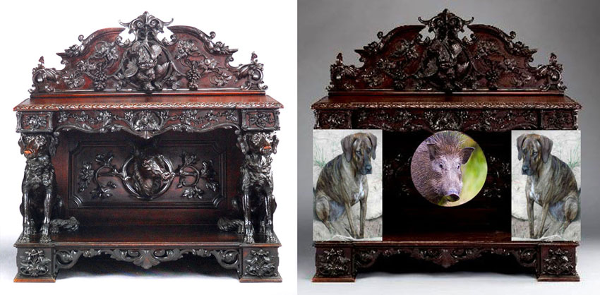
Other interpretations miss an opportunity to interest young visitors. A deer head is said to ornament a sideboard attributed to Alexander Roux. The prominent dogs sitting on either side of the head (at a nose-to-nose, eye-to-eye level for a child) are not mentioned. How exciting it would be for kids to know the real story or for adults to understand the 19th century dining room’s bloodthirsty material culture. The head is actually a wild hog’s and the dogs are boarhounds!
The color on the walls of the Rohlfs exhibition has a “truthiness” that subliminally and harmlessly adds to the story of this important American furniture maker. I am not so sure that the museum hype and Cunningham’s purple prose is as harmless:
“A protean artist, actor, and furniture maker dedicated to the primacy of individual expression, Charles Rohlfs (1853-1936) called his unprecedented designs ‘artistic furniture.’ This exhibition—the first major survey of his work—will present over 40 pieces of his furniture and related objects in the context of groundbreaking new research. Rohlfs’s virtuosic carving and imaginative silhouettes relate to Art Nouveau combined with a wide range of international design traditions; his innovations influenced the paired-down oak forms of the Arts and Crafts movement. Combining design motifs in remarkably inventive ways, Rohlfs created furniture like none other, whose story and legacy contribute a new chapter to the history of American design.”
- “Artist” is separated from “actor” and “furniture maker” as if to suggest Rohlfs produced fine art in addition to his activities in the dramatic arts and the art of furniture design.
- Rohlfs furniture might illustrate the “primacy of individual expression” for the modern viewer, but we can only imagine the degree of the man’s dedication to the concept.
- His designs are not “unprecedented.” “Artistic furniture” was a promotional category that existed in advertising for a long time before Rohlfs began making and marketing furniture.
- “40 pieces of his furniture and related objects” could have been enough to constitute a “major survey of his work,” but the objects selected for this exhibit don’t begin to demonstrate his “protean” capabilities and Carnegie’s Spartan installation fails to represent the overwrought, late nineteenth-century context of his place in decorative arts history.
- However imaginative his silhouettes may be, Rohlfs’s carving technique was no more “virtuosic” than any of many woodworkers carving during his era. The carvers at the Rose Valley Shops and even some of the women trained by the Frys and by Karl von Rydingsvärd were technically more skilled than Rohlfs. In fact Rohlfs did not do all the carving on his furniture himself. His innovations were hardly about “paired-down oak forms” and his influence on other furniture makers of the Arts and Crafts movement was insignificant.
- Rohlfs furniture is, of course, “like none other.” That quality alone is not what makes it worth studying or exhibiting in an art museum. Bugatti furniture, Greene & Greene furniture, or Frank Lloyd Wright furniture is like none other. A Barcalounger is also like none other and might fit into “The Art of Daily Life” on some kitsch level, but would it be appropriate on the Carnegie’s wall of chairs, hung among the iconic designs of Connelly and Haines, the Herter Brothers, Majorelle, Thonet, Breuer, and Gehry?
- The story and legacy may have been a new chapter in the history of American design back in 1972, when Robert Judson Clark first recognized Rohlfs’s genius and Dr. Cunningham was just a musical boy. Michael L. James wrote an extensive analysis of Rohlfs’s life and work in 1994 to accompany a “major survey” exhibition. The 2008 book and 2009 exhibit elaborate on Clark and James and take a stab at expanding the role of Mrs. Rohlfs in the production of Mr. Rohlfs’s furniture, but the story and legacy remain essentially unchanged. So that takes care of the Carnegie spin; now back to the spinning of Dr. Barnes and Dr. Cunningham, whose opinion of themselves appears below:
“virtuosic” ?
I thought you would be pleased and impressed to know that the Artistic Furniture of Charles Rohlfs has taken its place among the couple most lauded books ever written on decorative art.
We are terribly gratified to have this volume honored with these awards by selection committees full of experts who truly are the most significant and accomplished curators and scholars in the country. Their specific praise for the book singles out not just penetrating research and clear presentation of loads of new information, but in particular, the deep level of object analysis which is a hallmark of our work here at ADA 1900 Foundation.
- Winner of the 2009 Henry-Russell Hitchcock Book Award for the most significant contribution to the study of the decorative arts, sponsored by the Victorian Society in America
- Winner of the 2008 Charles F. Montgomery Prize for most distinguished contribution to the study of American decorative arts published in the English language from the Decorative Arts Society
- Winner of the 2009 Henry Allen Moe Prize for catalogues of distinction in the arts, given by the New York State Historical Association
After nearly five years of research and writing, it is very nice to have the book recognized as among the most important contributions ever to the study of decorative art. We could not be more proud of the book and hope that it will set a new standard for decorative art scholarship, especially in the period around 1900.”
The shortcomings of the lavish Dr. Barnes and Dr. Cunningham book may not have been evident to whoever decides what deserves which prize among the relatively few eligible American decorative arts books submitted by authors, museums, or publishers. The chair of the Book Award Committee of the Victorian Society, Ingrid Steffensen, refused to reveal the names of the other committee members. The chair of the three-member review committee for NYSHA’s Henry Allen Moe Prize, Cynthia Falk, was a little more forthcoming, but named no names. The Decorative Arts Society provided names and a summary of reasons the committee chose Cunningham:
“The Selection Committee felt the publication was extremely well-researched [sic] and was based on extensive primary documentation. Most importantly, however, Cunningham has written passionately about a seminal figure in the Arts & Crafts movement, the result of which is a major contribution in the field of American decorative arts history.
Members of the Montgomery Prize Selection Committee are Philip Zea, President, Historic Deerfield, Inc.; Katherine C. Grier, Professor, Department of History & Director, Museum Studies Program, University of Delaware; Pat Kirkham, Professor, Bard Graduate Center for the Study of the Decorative Arts, Design and Culture; Gerald W.R. Ward, The Katharine Lane Weems Senior Curator of Decorative Arts and Sculpture, Art of the Americas, Museum of Fine Arts, Boston; and Dr. Charles L. Venable, Director, The Speed Art Museum, Louisville, KY as Chairman.”
In the spirit of a Rohlfs bromide--“the things produced in the glow of enthusiasm are the things that have stood the test of time because they have been natural to the producer”—one could agree that the doctor “has written passionately.” Crimes of passion aside, I am pretty sure prizes from societies such as these don’t bestow recognition as “among the couple [and the other would be?] most lauded books ever written on decorative art” any more than Oscars turn a movie like Avatar into one of the most important contributions ever to the art of filmmaking. As they say, “You can put lipstick on a pig, but it’s still a pig.” The doctors have used a lot of lipstick in their book, but not enough to cover up flawed research for careful, objective readers, who know a little about Rohlfs and who have not been influenced by gifts or promised gifts to the institutions that employ them.
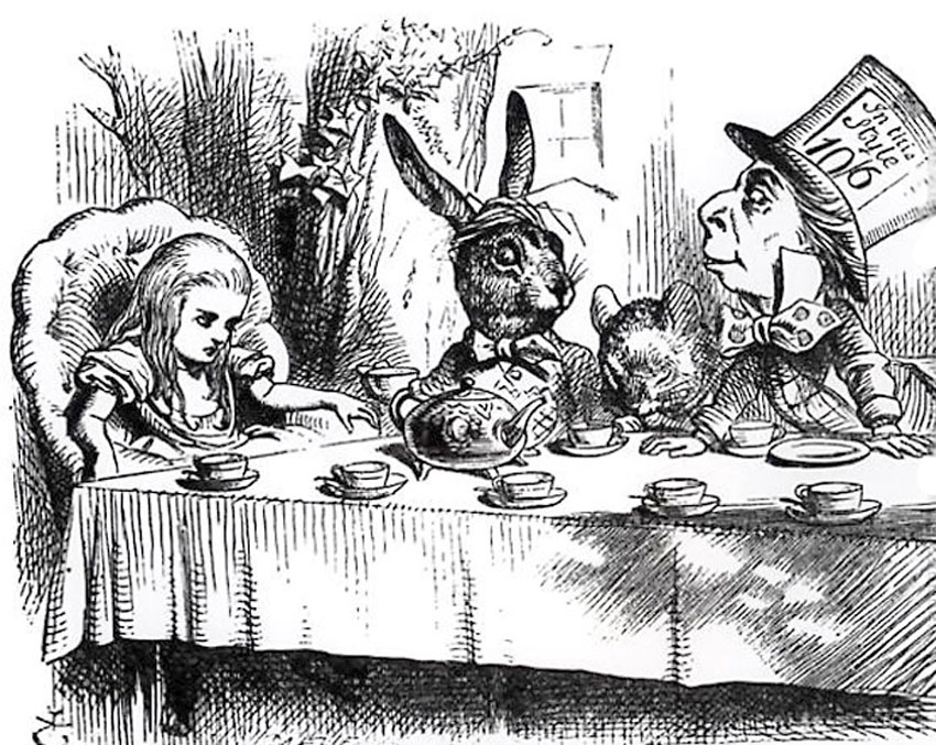
In many cases overwrought descriptions are passed off as “analysis.” I have the space and patience to cite only a few here, but a reader in search of something amusing to while away a dreary day will find many more seats at this Mad Hatter’s tea party.
“The deep level of object analysis which is a hallmark of our work” amounts to page after page of theorizing based on faulty premises and laced with such specific, analytical terms as “sublime,” “remarkable,” “stunning,” “profoundly rare,” “fully uncarved,” or “carved entirely from single boards.”
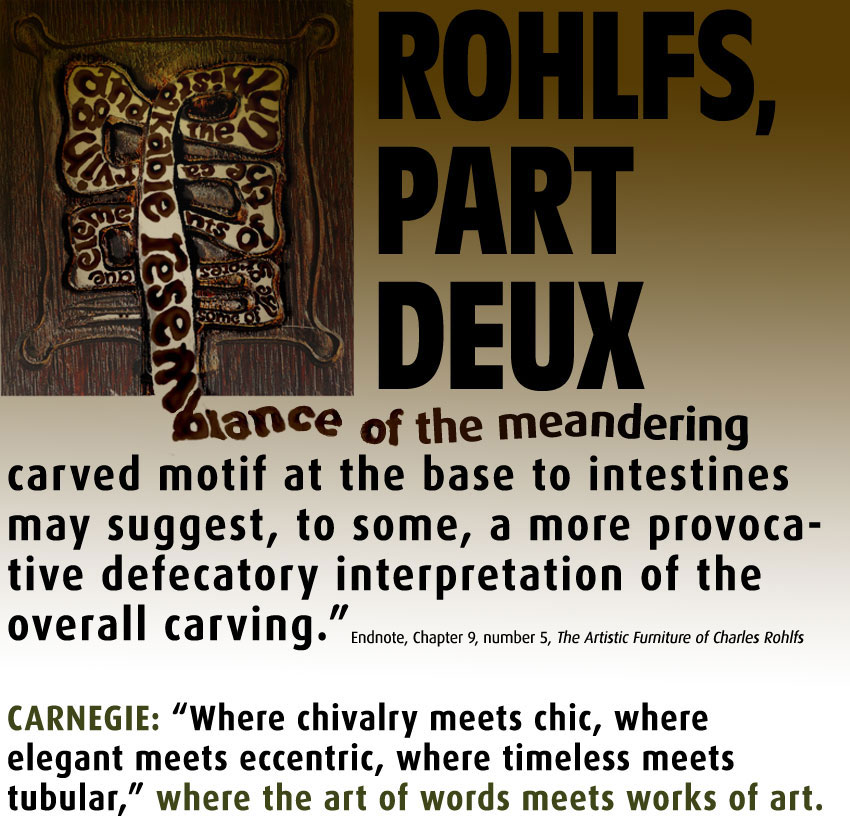
The doctor sees nightmarish body parts everywhere in Rohlfs carving, when it’s not mini gonads up against monstrous vajayjays, it’s pelvises riddled with cavities and spines spiked with jutting bean-shaped lobes.
Cunningham’s perceptive, provocative observation that the carving on the back of Desk Chair was inspired by the cellular structure of oak is disappointingly supported only by the fact that Rohlfs owned a microscope.
The reader is expected to credit Cunningham’s authority on points that should be accompanied by adequate endnotes with pertinent citations.
He repeatedly makes assumptions about Rohlfs furniture based on his notion that there is only one example of this or that piece extant when he would be wiser to leave room for new discoveries by writing, “only one example of this design is known to exist.” He, himself, discovered a previously unknown chair while writing his book. He does not know of another example of the design so he asserts that the single chair he found proves that a commission to make multiples for a Cornell fraternity was never carried out because his chair has a grain pattern matching the pattern on a chair in a period photograph. The story of the H. H. Richardson-designed chairs that were rescued from a dumpster as they were being tossed from the windows of the building they were meant to furnish should be remembered. I’m not saying Cunningham’s conjecture is inaccurate; I’m saying it proves nothing and is no more than a possibility.
He transforms his questionable Anna Katherine Green attributions into fact. He decides that “Anna K. Rohlfs” written on the back of a period photograph of a chair “is not a name by which Charles or Anna Katherine herself ever referred to her. Not in letters, diaries, or other communications is the wife, mother, author, or furniture-maker ever referred to this way.” and “ ‘Katherine’ as an Author, and ‘Rohlfs’ by virtue of her collaboration with Charles in the design and manufacture of furniture. Rather than ‘made for’ her, the inscription ‘Anna K. Rohlfs’ indicates her role, perhaps a significant one, in the design of this stunning piece of decorative art.”
This puddin’headed proof is particularly egregious when he attempts to “analyze” a canopy bed.
“An original period picture of this Bed [italics are the author’s way of denoting names of furniture coined by Rohlfs] descended through the Rohlfs family and exhibits nearly identical markings to the period photograph of the Desk Chair. The Bed was significantly altered soon after it was shown at the Pan American Exposition and is not known to exist today. The markings on the reverse of the photograph include the model number “32,” the price “$350” (the highest documented price for a Rohlfs object), and the words “Anna K. Rohlfs,” The price indicates that the Bed was made for production and that it was not a “one-off” design meant for Anna Katherine but rather one designed with her input. Its panels of carved wildflowers can be compared to the sinuous tall-stemmed variety shown on Anna Katherine’s book Lost Man’s Lane, published in 1898. This cover, which Charles and Anna, or the two together likely designed, reinforces our understanding of their collaboration on graphic and decorative art motifs.
This Bed is the only clearly identifiable Rohlfs object shown in period photography of the Pan American Exposition. It would make perfect sense that with the burdens of furniture production, moving his workshop, and managing employees, Rohlfs may have sought the design assistance of his longtime partner.”
As the doctor notes elsewhere, Rohlfs often gave numbers and prices to preexisting objects he intended to sell or to put into production once orders were received so the bed in the photograph may indeed be “one-off.” The presence of Anna’s name could have many meanings other than “designed with her input.” Her name appears on several other photographs taken by a professional photographer so it could as easily mean only that the photographs were to be delivered to her once the negatives were printed just as one now puts a name on the envelope of CVS processed snapshots,
The “wildflowers” on the “Bed” can be compared to the cover of one of Anna’s books, but there’s not much point. Despite the doctor’s assertion, authors or their husbands were and are seldom given the opportunity to approve trade book covers much less to design them. In this case the book-cover design is very nearly generic for its era and shows nothing of the Rohlfs sensibility. If anything suggests input from someone other than Charles, it would be the use of the poppy as a symbol of sleep, which seems more literal to me than most Rohlfs confections. But the poppies were rendered by someone with a lot more drawing skill than Anna had especially if one uses her sweet, if inept, Victorian-lady illuminations as a measure of her artistic abilities as Cunningham does when he writes about her participation in the design of an early settee:
“These disjointed motifs are unusually derivative, pointing squarely to Charles’s, but even more strongly to Anna Katherine’s, debt to the two dominant design styles in America at the time—Victorian and Beaux Arts, the latter of which was especially dominant in larger New York cities in the last decades of the nineteenth century.”
“Victorian” would have to be a dominant style during the Victorian era, but decorative arts historians have long rejected “Victorian” as a distinct style. Myriad styles including Beaux Arts emerged and ran their, sometimes parallel, courses throughout Queen Victoria’s nearly 64-year reign, which ended in 1901. Even if Beaux Arts style were especially dominant in New York cities, Cunningham does not convincingly show how it relates to either Charles’s or Anna’s work.
Neither the “Bed” nor the photograph of the “Bed” can be dated accurately so one cannot assume that it was built during the period immediately before the Pan American Exposition opened in 1901. I know of no egotistical designer (myself included) who would seek the design assistance of a longtime partner even or especially during preparation for such an important event. I’d sooner let the partner manage the employees. The jump from the main text to captions for the photograph of the “Bed” and book cover morphs these shaky theories into established fact. The bedspread on the “Bed” is made of the same fabric used as a backdrop in the “original period photograph” of a chest made for Roland Rohlfs in 1916. Now this fleur-de-lis patterned textile may have been hanging around the various Rohlfs homes for years and it may have been commandeered for the Bliss Brothers photo shoot, which for the sake of practicality may have taken place with one set up or backdrop over a period of days, but probably not over a period of years. Period photographs of a bedroom in the Rohlfs home show a bed with carving on the corner posts that appears to be identical to that on the lower parts of the posts on the “Bed”. If this bed is in fact the altered Pan American Exposition “Bed,” one might conclude that the photo shoot occurred between 1916 when Roland’s chest was made and the 1920s, which is the date given to the bedroom photographs.
The scope of Rohlfs’s production is not represented by the highly selective choices included in this book, which implies that the number of extant examples of the shop’s output is much smaller than it really is. A catalogue raisonné or merely a list of known examples would have been very useful and easy to compile, but such a compilation would have a serious impact on the doctor’s opinions and on his ADA 1900 collection.
The book gives the impression of being an all-inclusive survey of Rohlfs production, but it leaves out whole suites of furniture that were notable for their unadorned yet radical simplicity.
Rohlfs claimed he began to make furniture because he and Anna needed to furnish their home; they couldn’t afford the “Colonial” antiques they admired and didn’t admire available mass-produced furnishings. The only place in the book that suggests Colonial Revival influences is the reproduced catalogue where one finds names like “Martha Washington,” “Ben Franklin,” or “Alexander Hamilton” for candlesticks, which seem to have nothing “Colonial” about their design.
Rohlfs’s references to American history would be easier to understand if one were aware of family photographs now in the Winterthur Library. Tellingly these research materials were given by ADA 1900 with a restriction prohibiting public access until a year after their book was published. Among the many professional photographs is one of a large sideboard made by Rohlfs in what we now call American Classical style. For most of the 20th century such a sideboard would have been categorized as “Empire,” but when Rohlfs made his mahogany version, furniture like this was marketed as “Colonial” even though the furniture it imitated was made in the 1830s. The Rohlfs sideboard is monumentally simple and reminiscent of “Mission” sideboards, but much “Empire” furniture has the exaggerated proportions and decorations that distinguish Rohlfs designs.
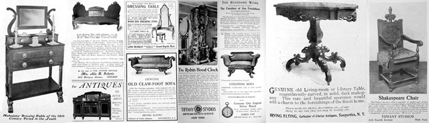
The “Louis Quatorze Sofa” was actually no more than fifty years old when Rohlfs began to make furniture. Tiffany claims that his “Shakespeare Chair” is an “early eighteenth century design, made up from the carved pew ends lately removed from Holy Trinity Church, at Stratford-on-Avon, where lie the remains of William Shakespeare.” Whatever one may think of these travesties, Rohlfs may have thought their “virtuosic carving and imaginative silhouettes” inspiring.
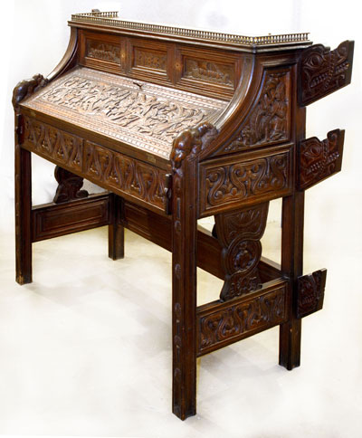
The doctor seldom mentions restorations on objects owned by ADA 1900, but he goes to extraordinary lengths to document restorations on pieces belonging to others in an attempt to diminish their significance. He has the gall to denounce the desk now at the Virginia Museum of Art as a copy, but never mentions that precious little is original on ADA 1900’s “Candelabrum,” which he considers to be a unique masterpiece. He smears his most “defecatory” invective on the “Desk with Overhead Gallery” in a bald-faced effort to aggrandize ADA’s more pedestrian “Desk with Suspended Gallery.” He proclaims that the structural problems with “Desk with Overhead Gallery” required that the overhead gallery be remounted in such a way that the chains no longer carry weight. As I see it, his argument carries no weight; the dramatic visual effect is not diminished and “Desk with Overhead Gallery” still outshines ADA 1900’s “Desk with Suspended Gallery.”
“Desk with Overhead Gallery” has long been associated with “Carved Swivel Chair,” but the doctor has decided that they should not be paired because the chair does not fit in the kneehole of the desk. He thinks the chair was more likely to have been paired with “Library Table” from the same commission, which he dates to 1898 or 1899 because drawings of it survive on the back of a manuscript page from a novel Anna Rohlfs was working on at the time. There is absolutely no reason that the drawings should date to the same time as the writing of the novel or that the drawing was done as a preliminary sketch as the doctor supposes when he marvels “when Rohlfs put pencil to paper, he had a rather clear concept of formal [whatever that means], structural, and decorative details. …Though sketchy in quality and lacking in detail, [the drawings] give a remarkably full sense of the Library Table as it was completed…” I can come up with another credible if imaginary scenario where Rohlfs is entertaining a prospective client at home among his many pieces of “inventory,” none of which exactly suits the client’s needs; Rohlfs grabs the nearest scrap of paper and makes a quick sketch of the completed “Library Table” to show the client other options.
There is no reason to expect a prize committee to know that there are a good many more green Rohlfs pieces around than the “Desk with Overhead Gallery,” the “Carved Swivel Chair,” and the “Library Table” that the doctor guesses “may be the only extant examples of Rohlfs furniture with green exterior finish.” Nor would committees know that few library tables of the period could be used with a chair. As any Arts and Crafts collector knows, the apron or drawer on a library table is usually too low to allow an armchair to be drawn close enough to work at the table and if it isn’t, the stretcher under most library tables crunches a sitter’s shins.
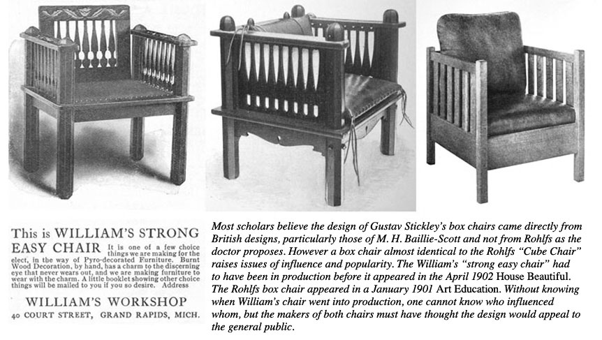
I have demonstrated how far-fetched the Stickley connection is in “Gray Area,” but there is another misleading detail that should be highlighted: The doctor characterizes Rohlfs as competing with Stickley without a citing a Rohlfs statement to back up the idea. As far as I can tell, Rohlfs was a staunchly independent artist who pretty much disdained the product of factory men like Stickley. Cunningham wildly over estimates Stickley’s influence on Rohlfs by pointing out that Stickley offered a corner cabinet in 1902, two years before Rohlfs produced his “Corner China Cabinet.” Both are made of oak and both are made to fit in a corner, but is that enough to conclude that the Rohlfs model’s “basic shape, proportion, and configuration bear a close resemblance to Stickley’s earlier model”?
Dr. Cunningham tries to forge a connection between Rohlfs and the great Scottish designer Charles Rennie Mackintosh using nothing more substantial than the power of suggestion. He wonders if Rohlfs saw Mackintosh’s bookcase for Windyhill before designing “Standing Desk” or, more fantastically, if the 1902 “Standing Desk” may have “affected Mackintosh’s designs for the extremely similar 1902 cabinet, with inlaid glass panels inside the doors, for 14 Kingsborough Gardens…” Move over Glenn Beck!
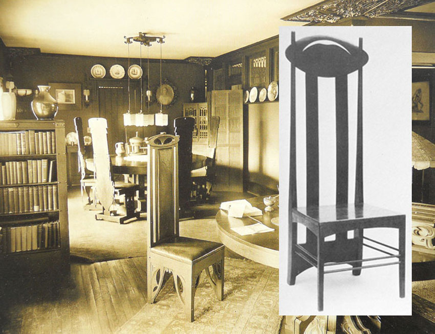
When the doctor is not suggesting that Rohlfs could have inspired Mackintosh, he is chiding Rohlfs for not copying Mackintosh well enough.
“Also present are Rohlfs’s interpretations of various turn-of-the-century chairs, including his attempt at Charles Rennie Mackintosh’s iconic high-back oval-top form; these attempts fell short of the mark.”
I question the “mark” because the oval cutout at the top relates more closely to the cellular motifs Rohlfs used throughout his career. I for one would be very happy to own this chair with its highly original and inventive use of Gothic motifs.
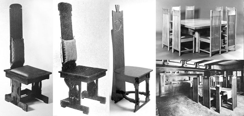
The doctor goes on about how the Rohlfs high-backed chairs were influenced by or influenced Frank Lloyd Wright’s and the other Prairie School architects’ designs. He also argues that Rohlfs furniture was popular in its day. The Wright connection is supported by the fact that the Martin House was in Buffalo where Rohlfs lived and worked. Rohlfs’s popularity is gauged by what hack writers of the day wrote in shelter-magazine fluff. An opportunity to support both theories was missed by giving short shrift to Rohlfs’s many and varied high-backed dining chair designs. Dinning chairs and tables were produced at the Rohlfs shop in numbers greater than any other Rohlfs design. A comprehensive list would probably show that they formed the bulk of his production and sales. Grouped around a table, his tall-backed chairs form a room within a room just like Wright’s designs for the Barton dining suite (part of the Martin complex in Buffalo) or his more famous Robie dining suite.
An illustrated article about Maher’s Rockledge commission apppears in TILLER, Volume I, number 6, 1983.
“We support collection development at museums around the country through judicious loans and gifts of art, as well as strategic advisement on acquisitions. We work closely with curators at more than twenty museums on scholarship, exhibitions, and object research, conservation and installation.”
“Strategic advisement” is evident in their loans to Carnegie. In a collection that seems to highlight masterpieces, their ordinary Craftsman Morris chair with a later finish and new leather seems out of place. It might be representative of Stickley’s democratic aspirations, but it doesn’t represent the art of his furniture designs.
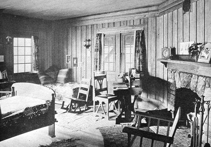
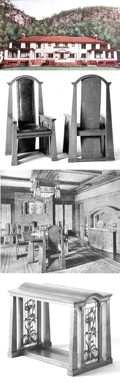
A giant chair designed by George Washington Maher for Rockledge is also on loan. Standing as it does next to the Stickley chair and a Mackintosh chair, it says nothing about Maher’s “motive-rhythm” theory, which filled the Wisconsin house with repeated motifs like a distinctive tripartite dentil, and a shallow arch (both of which appear on the back of Carnegie’s chair), and wild lilies as well as a palette of browns, salmon pink, and muddy green. The green is still evident on the chair, but there is no note to highlight its significance to the visitor. I lived with this chair for some years. When I sat in it, I was first struck by its exaggerated size and then by its poor ergonomics. Since the sale of the Rockledge contents in the early 1980s, no one has brought enough of the many surviving Rockledge furnishings together again so the now unperceived motif of surrealistic scale has never been interpreted.
Like Hansel and Gretel, some museum curators must learn to resist the lure of ADA 1900 candy. After years of “advisement” on the exhibition “Gustav Stickley and the American Arts and Crafts Movement” organized by the Dallas Museum of Art, the doctors grabbed all their toys (loans) and went home because Kevin Tucker, the Margot B. Perot Curator of Decorative Arts and Design, displeased them. It will doubtless be a more enlightening, objective show with Stickley production lent from the many private collections and museums that own pieces superior to the Stickley furnishings owned by ADA 1900.