 A New York Times critique of the new Musée du Quai Branly, which is dedicated to objects from non-European cultures, provided perspective for my unfocused thoughts about the two new museums I visited while attending the Initiatives in Arts & Culture Arts and Crafts conference in Minneapolis this summer. Author Michael Kimmelman weighed the merits of museum buildings and installations that intend to edify an audience (the Louvre, for instance) against those that intend only to present objects without interpretation. He says the Quai Branly, conceived by Jacques Chirac and designed by Jean Nouvel, “…simply makes no sense. Old, new, good, bad are all jumbled together without much reason or explanation, save for visual theatrics. … [The museum’s story] is the spectacle of its own environment.” The United States is being inundated by a tsunami of tourist-attraction museums designed by supernova architects whose stories are almost always the spectacles of their own environments. Of course, museum as spectacle is not a new phenomenon. The spectacular original environments of the Gardiner in Boston, the Guggenheim in New York City, and the Kimbell in Fort Worth should have been sacred but instead have been tarted up with snack bars, gift shops, and other modern “necessities.” The homogenization of once unique collections has become part of the spectacle in America. Long before a new building is ordered up by museum trustees, administrators, curators, and donors, the requisite Chihuly or Oldenburg (or, even better, both) has been purchased because nothing else can furnish the upper reaches of double-height public spaces—every theme park must have a water slide to satisfy the crowds. Headcount, not edification, is the modern bottom line, so spectacle counts for a lot. |
||||||||
 |
 |
|||||||
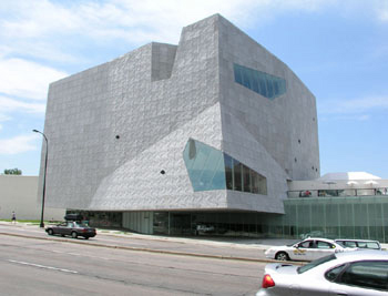
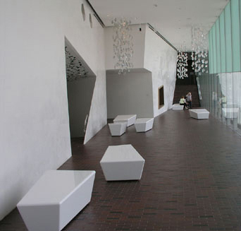
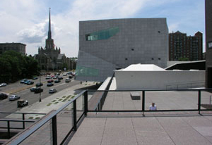
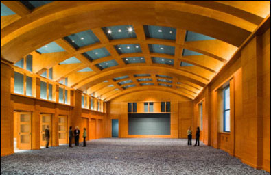
| Minneapolis is itself a spectacle of modern architecture. Within that spectacle are two museums with spanking new additions: The Walker Art Center has a new building designed by Herzog & de Meuron, and the Minneapolis Institute of Arts has one designed by Michael Graves. The Walker building, with its shiny, crumpled metal skin, polished plastic interior walls, and crystal-chunk lighting is a Barbie® crack house decorated by Harajuku Girls. The Minneapolis Institute of the Arts’ Target Wing, with its cut stone, polished wood, and Pantheon dome, is a postmodern mausoleum. Although neither building appeals to my taste (I think the Walker is bad, virtuoso design and the Target is good, pedestrian design), I was worried my reaction to the Walker was old fartism. Could my dislike for its trendy patterns and tacky (though almost certainly not cheap) materials be based on an antiquated 1960s Rhode-Island-School-of-Design aesthetic? Would I live to see the day when the Walker would transcend the message I now receive from its materials and become a great design of its time? |
 |
|||||||
 |
||||||||
| Then I thought of two buildings that once stood in New York City: the Charles Atwood/Herter Brothers design for the William H. Vanderbilt House and the McKim, Mead, and White design for the Henry Villard houses. While the same lavish, fashionable (and so “modern”) decorative vocabulary was employed for both buildings, the former never surpasses fat-cat, fin-de-siècle vulgarity and the latter achieves a refined, progressive aesthetic. The Vanderbilt “spectacle of its own environment” would go out of style, not to be revived until a century later when the Herter worshipers (modern fat cats) placed its accoutrements at the pinnacle of desirability. The decorative surfaces in the Villard “design for living” would develop into Sullivan/Prairie-style embellishments and have obvious influences on Claude Bragdon’s outré design systems. I do not mean to equate the Walker with the Vanderbilt House or the Target Wing with the Villard houses. To do so would accord the Graves design too much beauty. |
||||||||
|
||||||||
| The de Young Museum in San Francisco rhapsodizes about how the “natural materials” of its new Herzog & de Meuron building “relate” to its park setting; the Walker PR department seems to resist explaining its new wing to the public. I don’t know if they are brave or cowardly, but it does seem wise not to equate the dotted Swiss concrete terraces or the leaf fretwork around the gallery entrances with anything in nature. |
||||||||
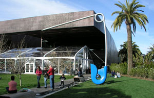
| Even in the height of summer, the Walker site is harsh and raw with nothing natural near it to relieve the hard surfaces of the surrounding highways—it must be lunar in winter when what little green allowed into the sculpture garden is gone. Once the leaves have fallen, Oldenburg’s Spoonbridge and Cherry, which dominates the garden, might be visible from one of the few vantage points inside the mostly windowless museum. The de Young’s Oldenburg safety pin also dominates its sculpture garden, which is much smaller than the Walker’s. The de Young wins the big cliché contest, though—it has a big glass Dale Chihuly installation. |
 |
|||||||
 |
 |
|||||||
|
|
||||||||
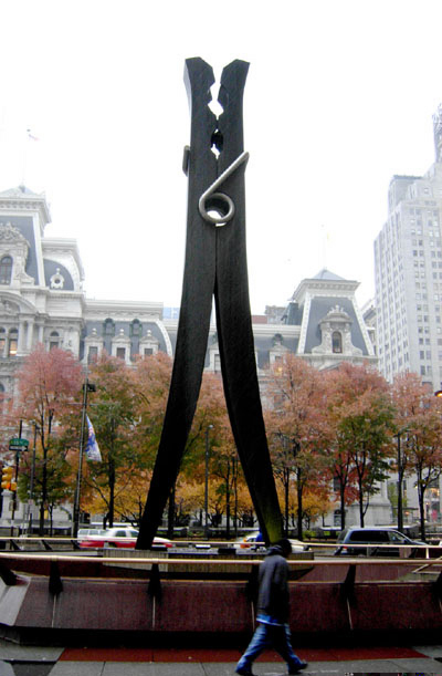
| For me the first big Oldenburg or Chihuly thing renders the next big thing redundant. The gigantic scale of Oldenburg’s 1976 Philadelphia Clothespin abstracts the shapes of a real wooden clothespin so art transcends any reference to reality. His Trowel I is less transcendent than Clothespin, and Trowel II is never more than just a big, fake trowel. Still, every art museum in this country seems to want what every other art museum has. Models for the new Libeskind addition to the Denver Art Museum show an Oldenburg in place outside. In a time when transportation from one location to another was more difficult, a Chihuly in every port might have made as much sense as the cents in Chihuly’s pocketbook—every local yokel could be edified (or at least amused) by high art. These days, a family that is willing to spend what it takes to get from their home in Cornish, Maine to a theme park in Orlando, Florida could as easily get to the Getty in Los Angeles if they wanted. I think globalization means that museums can once again specialize so their collections can be unique—the Barnes could stay the Barnes rather than move to Center City Philadelphia (Wouldn’t it be swell if they got Oldenburg to supersize The Dance for the new museum’s front yard?) where it will ostensibly be more accessible to more people. Winterthur wouldn’t need fake sheep, fairy gardens, and fashion shows to draw in tourists. |
 |
|||||||
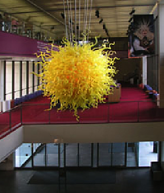 |
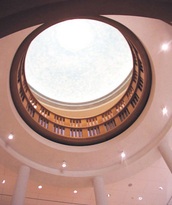
A Chihuly sun brightens the inside of the Target Wing at the Minneapolis Institute of Arts. Could it possibly be that the museum had to take Michael Graves if they wanted Target’s money? I find a toilet brush designed by a former architecture star to be a little sad but also a little amusing. I am not amused, however, when that toilet brush is transformed into a door handle for an art museum. In 1980 Graves pasted blue metal ribbons on the sides of the Portland Building—that seemed like fun back then. Twenty-five years later he has designed a neoclassical tomb that’s no fun at all despite the stage set-like dry-brushed sky on the central dome. At least the dome blue is not the Target-plastic-tchotchkes blue Graves slathered over the parts of the grandiose reception room not veneered in reddish-colored wood. One suspects that, like the furniture in Target stores, there is only flake board behind the acres of paint and veneer. The building has the look of architecture and structure but is without substance or integrity—maybe this one-note joke is all that’s left of postmodern style. But Graves’ dull display spaces serve art better than the scary tumbling plastic walls of the Walker’s new funhouse. | |||||||
 |
||||||||
 |
 |
|||||||
| When I was at the Institute the Norwest Collection of “modernism” was appropriately installed in the Target Wing. I say “appropriately” because both the building and the collection are dead issues. The icons of twentieth-century merchandise design assembled by David Ryan for the now-defunct Norwest Corporation created a “spectacle of their own environment” but did not edify. A ravishing automobile delighted the general public, but entertainment was the limit. There was no way toward a better understanding of modern design in this willy-nilly installation. The Norwest Collection has no potential to edify because each object was elevated to top-hit status long before Ryan spent millions of Norwest dollars on them. Sadly, as a collection, these objects have no more to say than another Chihuly or Oldenburg. Why go to Minneapolis when you can see the same vacuum cleaner in museums across the United States from Portland, Oregon to Portland, Maine?
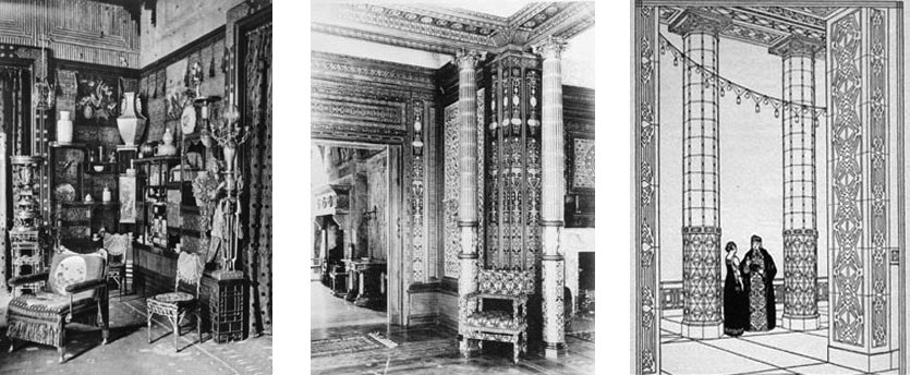
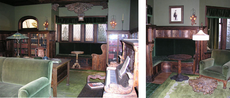
What you can’t see the same way anywhere else in this universe is John Scott Bradstreet’s work. The Institute’s installation of the Prindle living room makes a unique and valuable contribution to the preservation and history of American design. This appears to be a meticulous reconstruction and not a mere room setting, so in spite of somewhat kitschy fake panoramic views through the windows there is more integrity and less ersatz creative interpretation than in the other dry period rooms surrounding it. Reconstructions like the parts of Frank Lloyd Wright’s Little House now at the Met and the Allentown Art Museum are ridiculous space wasters. Since Wright masterpieces like the Dana House exist with most of their original furnishings and are open to the public, the value of reconfiguring bits of molding from a minor work like the Little House is little to nil. By comparison, the Prindle room is not only a Bradstreet masterpiece; it is the only way his eccentric vision can be shown to a wide audience. |
||||||||
 |
||||||||
| “If I were King of the Forest, not Queen…” I’d have all Chihulys made after 1990 shipped to a desert mesa where they would be stacked into one Oldenburg-sized suncatcher. Then I’d use the money from selling that glassware to make unique specialized collections in museums that are not megaplexes like the Met or Chicago or Boston. The big museums would not be allowed to buy additional objects for their collections—their funds would go to conserving and interpreting what they already have. There would be no more blockbuster shows that put art at risk—no more shipping fragile Fra Angelicos, no more heavy breathing on their delicate surfaces. “If I—if I were King!” | ||||||||
 |
||||||||