My interest in Daniel Pabst (1826–1910) evolved from a fascination with what seems to me to be the odd, ungainly aesthetics of most Philadelphia decorative arts design, which led me to Frank Furness and through him to Modern Gothic. This haphazard approach is not academic because it relies almost entirely on aesthetics, but it did bring me in close contact with a few outstanding pieces that, for one reason or another, are now attributed to Pabst. It also means I have not paid much attention to his less stylish pieces that probably made up the bulk of his production, nor to those other Philadelphia furniture makers whose work stood cheek by jowl with Pabst’s in the crowded domestic, institutional, and commercial interiors that existed in Philadelphia and other American cities during the second half of the nineteenth century.
The Philadelphia Museum of Art is planning an exhibit about Pabst, so they are gathering any and all new information that has surfaced since 1977 when David Hanks and Page Talbott summarized the earlier Calvin Hathaway research in a museum bulletin. The museum has come up with an innovative and cost-efficient method of compiling this new material: They have asked private and institutional collectors of Pabst objects to be curators and catalogue their own holdings for the museum’s records. The products of these efforts, as they stand at the moment, were presented for review at a preliminary, closed study day held on October 20, 2008. The results were revelatory in good and not so good ways.
Dastardly dealers were not invited to attend until it became apparent that they have been the primary keepers of the flame since 1977. Curators in their ivory towers and private collectors busily piling up the wherewithal to purchase Pabst were not the ones with their feet on the ground at obscure auctions, in dusty attics, and in far-flung antiques shops. I got through the door in part because I stumbled over the circus wagon at the Met (which has come to represent the pinnacle of Pabst’s achievement), but mostly because a major collector asked me to catalogue and present her Pabst objects. Now I have never been a professional curator, which is liberating because I have no responsibility for what I don’t know or should know—as another song (I seem to have more than a song in my heart) goes, “Freedom’s just another word for nothin’ left to lose.” As it happened, it was probably not a good idea to invite dealers, as they often embarrassed the curators who presented Pabst objects because the dealers knew more about style, original condition, provenance, and significance than the museum professionals.
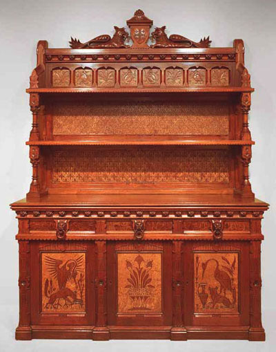
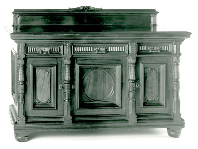
Whatever one may think about the aesthetic qualities of a sideboard now at the Art Institute of Chicago, it undeniably has many details significant to Pabst research. When questioned about the curiously brilliant finish, the curator revealed that she knew nothing more or less than what the dealer who sold it to the museum had said in her sales pitch.
I discovered the cabinet, now at the Brooklyn Museum of Art, in a flea market where it was being used to display collectible beer cans. Except for a few can rings on the shelves, the original finish was in remarkably good condition. One drawer knob was broken and missing about a third of its flower and there were obvious marks on the cabinet sides, which indicated to me that it had once been built into a room or that something was missing. Peter Strickland bought the cabinet from me in “as found” condition. Meg Caldwell bought it from Freeman’s auction house in 1986. By the time the Brooklyn Museum acquired it, all evidence of the broken knob and lost sides had been obliterated and, if their online catalogue information is any indication, Brooklyn has no idea why the cabinet is attributed to Pabst.
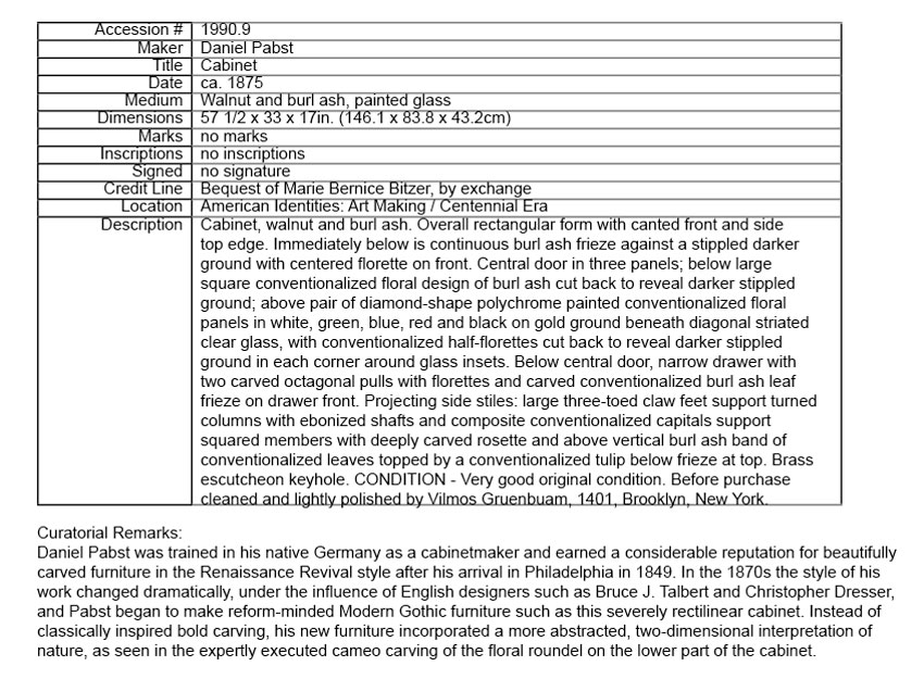
Of course, I was aware of all the details discussed in the “Curatorial Remarks.” I was also aware that the ribbed, reverse-painted glass inserts relate to similar tiles on the Pennsylvania Academy of the Fine Arts building. The finish now on the cabinet is something much more than “cleaned and lightly polished”!
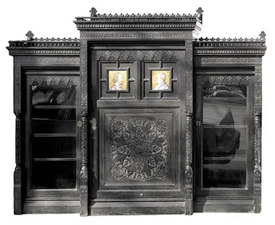
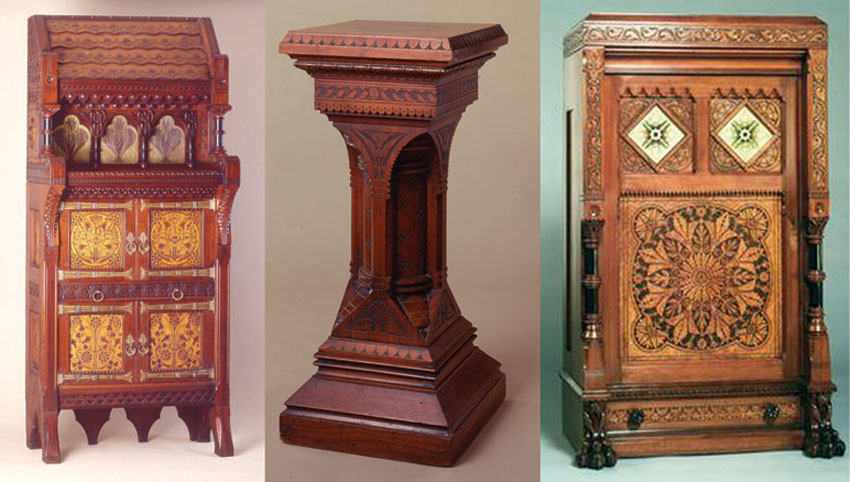
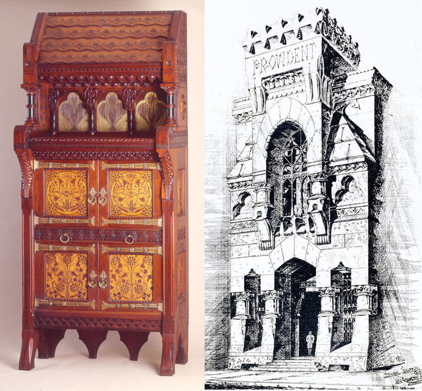
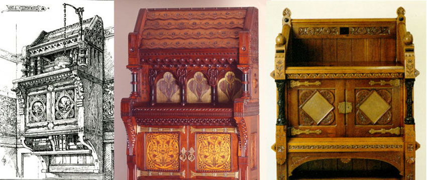
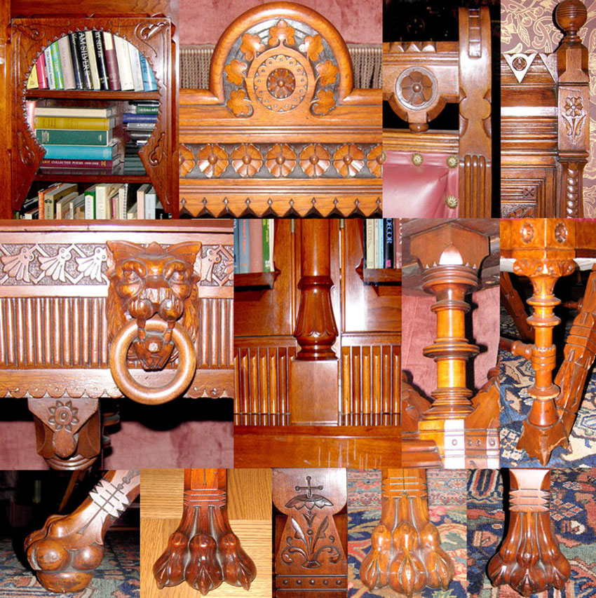
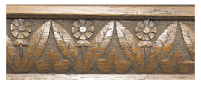
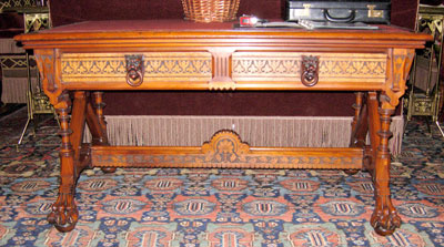
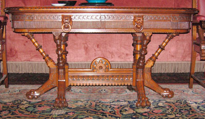
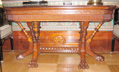
A complete version of Brooklyn’s cabinet is offered at http://www.postroadgallery.com/pabstcredenza.html I did not know the piece had lost its “wings” until long after I sold it, when I saw an ebonized version at the Neary shop, which had a drop-front desk in place of the central door and incised wood panels above instead of glass tiles. The present owner of that cabinet has doubts about the origins of the black finish, which could be hiding evidence of lost side cabinets. Of course, other variations have since surfaced. I am willing to say Daniel Pabst made these cabinets because I discovered a bit of what might be a shipping label or a working drawing behind one of Brooklyn’s glass tiles on which were written the letters “st” and apparently “b,” which I take to be part of the name Pabst. The assumption of a close relationship between Furness, Pabst, and the Modern Gothic style, while apparently sound, tends to overshadow the fact that, as far as I know, there is little other than a set of visual cues to link designer with maker. I am not prepared, therefore, to say with certainty what was or was not made by Daniel Pabst’s company from Frank Furness designs. The design of the known signed pieces has nothing to do with Furness. I also want to be careful not to imply that Pabst had a direct hand in the design or manufacture of every piece of furniture that may have been produced by his company. Then, as now, the marketing hyperbole printed in trade journals and newspapers is not reliable and does not qualify as a basis for attribution. As Page Talbott made clear in her study of a Pabst peer, the spin doctors of the day claimed Allen & Brother to be “the most noteworthy,” employed only the “most skilled” workers, and used no machinery. Identical praise was lavished on Pabst—the often-quoted 1886 profile goes further to tout Pabst & Wrauss as “pioneers in the trade here.” What is credible about that assertion when referring to a city that already had a century-old tradition of making some of the finest furniture in America? Philadelphia had a large community of expert German woodworkers long before Pabst set up shop, and they were still hard at work after Pabst stopped making furniture. By 1901, when Will Price was setting up his furniture-making enterprise in Rose Valley, he wrote that he could not find skilled craftsmen in the city, even though he had expertly carved woodwork produced for at least a decade before he established Rose Valley, where pieces that were virtually identical to his earlier work were stamped with the community trademark. Apparently, old Arts-and-Crafts-straight-talking Price even slapped the Rose Valley trademark on pieces made in the Philadelphia workshop of Belgian John Maene. My point is that throughout the nineteenth century and into the twentieth, all furniture-making establishments, except for mechanized production companies, drew from the same pool of local craftsmen, and it is likely that some of the best went from one company to another. The Met’s grand cabinet was part of an estate that inexplicably had at least two other pieces of virtuoso woodwork: a music cabinet with elaborate decorations on the door and a lectern carved by Karl von Rydingsvard. The music cabinet was not Modern Gothic in style, but I remember thinking at the time that it might have been made by Pabst. More important, though, was the fact that, except for details like the glass tiles on the Met’s cabinet, nothing in the estate had anything to do with Frank Furness. When the late Catherine Voorsanger and I discussed what was to be written on the museum label, we both decided that, while there are many details tying the piece to Philadelphia and Pabst, there is little to suggest that Furness had a hand in the hodgepodge design other than as inspiration. To be sure, there is a relationship between the cabinet proportions and the cramped proportions of some Furness buildings that were designed to fit in Philadelphia’s distinctive rows of narrow facades. The freestanding cabinet has no reason for its shape, while a building like the Provident Bank looks like it does because of the intended Chestnut Street context where it was jammed between two similarly proportioned buildings. In my opinion, the piece is an exhibition of the maker’s varied technical skills, and its design does not have the logic I see even in the designs of an architect as eccentric as Furness. The top section is a direct quote from Bruce Talbert and as such need only be compared to a desk, which was once a wall cabinet carved by Louise McLaughlin, to demonstrate that its details are not specific to Philadelphia or Furness. Now, though, an entry on Wikipedia suggests that the cabinet is collaboration between architect and cabinetmaker. Pieces belonging to Barrie and Deedee Wigmore exhibit many of the details now attributed to the Pabst workshop: the paw foot that goes back to Philadelphia classical and before; the lion mask pulls with wooden rings; the stumpy, ringed columns; the flower with rounded petals; the paired leaves and serrated edges; the cameo carving enhanced by stippling; notched shelf supports; pivot hinges; and castors recessed in the feet. However, I want to be careful not to make the mistake of comparing apples to apples and oranges to oranges or, as happened during the study day at the Philadelphia Museum of Art, Pabst to Pabst.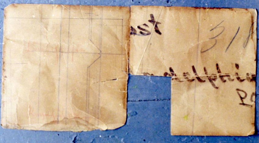
The quest for all the bells and whistles crammed onto one piece might overshadow aesthetics—the design of what, to my taste, is one of the most beautiful pieces attributable to Pabst relies on simplicity, good proportion, and fine mahogany for success rather than an encrustation of dissimilar decorative vocabularies layered on a form, which is radical just for the sake of being radical. http://www.biggsmuseum.org/index.html
I have to admit that I haven’t done the work of putting together enough Modern Gothic pieces made by other Philadelphia makers like Allen & Brother or Lejambre, or makers outside the city like Emil Bang from New York or Isaac Scott from Chicago (who got his start in Philadelphia) to see how they used all those “Philadelphia” motifs.
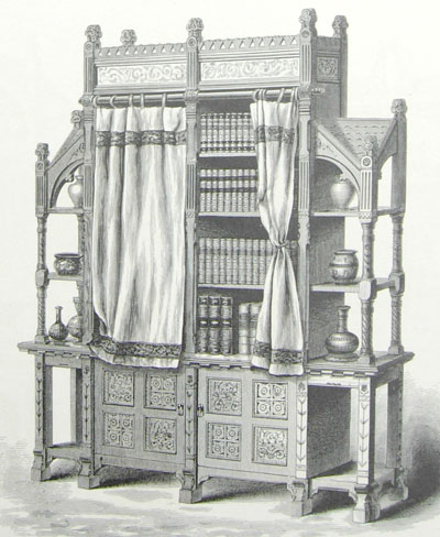
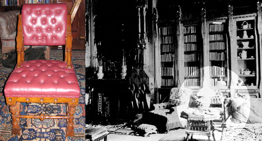
The PMA desk and Wigmore bookcases in the library of the Horace Howard Furness Philadelphia town house
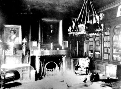
The desk and bookcases under a balcony to the right of Furness sitting in his library at his summer house Lindenshade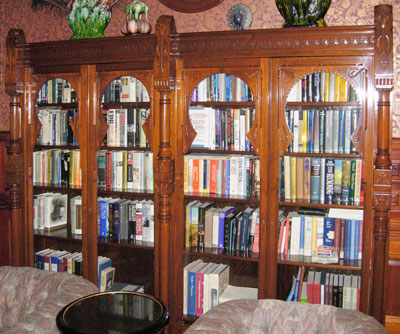
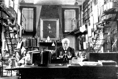
The H. H. Furness bookcases in 2008
Even if we didn’t know the provenance of the Horace Howard Furness bookcases, which were made for his city house, the details would lead us to suspect Frank’s involvement. In this case, there is at least some documentation in the form of a copy of a copy of a letter, which supposedly says Pabst made the furniture for this house, which is very convenient because it establishes one link to a Furness-designed desk from the same library now owned by the Philadelphia Museum of Art. Wendy Kaplan made a claim that Pabst made chairs designed by Furness for the dining room of the same house, even though period photos show the dining room with furniture of a very different style from the chair she illustrated. I would like to find more proof of which Frank Furness designs Daniel Pabst realized.
Much is made of the collaboration between architect and cabinetmaker, yet we don’t know who did what. I don’t think Pabst’s importance is diminished if we at least entertain the idea that he began using Modern Gothic motifs and cameo carving after he saw how successful the Furness designs for the Horace Howard and Theodore Roosevelt dining rooms were. As a dealer, I understand what a difference the connection to Pabst through Furness makes to the price, although I don’t understand why Pabst should bring three or four times what any other Philadelphia maker of his era can bring.
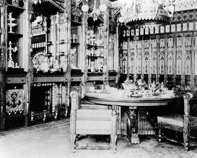
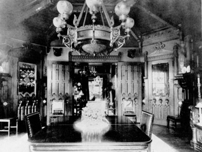
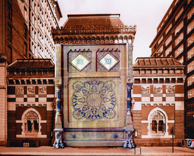
The dining room in the Theodore Roosevelt, Sr. New York City house is on the left and the dining room now in Media, PA as it looked when it was in the Horace Howard Furness Philadelphia house is on the right. Some of the Furness-designed furnishings of the Roosevelt dining room still exist. Decades ago, the Museum of Fine Arts, Boston was collecting pedestals so they could display their sculpture in an appropriate period manner. At the time, Kaplan bought a pair of pedestals from me, not because there was so much visible evidence linking them to Philadelphia, Furness, and even Pabst, but because such Modern Gothic style is rare in this form. Now generations of museum professionals have come and gone and with them the plans of how to use the pedestals, which were languishing in storage until the kiss of the Philadelphia Museum of Art brought them to life again. Evidently, all pertinent details about Philadelphia Modern Gothic were also forgotten, even though Kaplan had published many informative photographs in an Antiques article she wrote while still at Boston. The skeptical curator presenting Boston’s pedestals at the study day sounded a lot like Sarah Palin wondering at the absurdity of French studies of fruit flies. The slightest bit of preparation would have saved her from comparing the patterns on the pedestal columns to the rails on the stairs at the Pennsylvania Academy of the Fine Arts because they are both diagonal. Curators often look with their textbooks instead of their eyes. While there is nothing about the pedestals that proves they were made by Pabst, they have an encyclopedia of details that are identical to evidently Furness-designed and presumably Pabst-made furniture: the stumpy proportions of the columns; the “egg and dart” borders on the beveled edges; the stippled flowers; what is, post study day, being called “punctuated dot” borders; the notched arches; the leaves (paired and otherwise); the combination of flat design and modeled design like the “acanthus cornice”; and even the wood and original finish.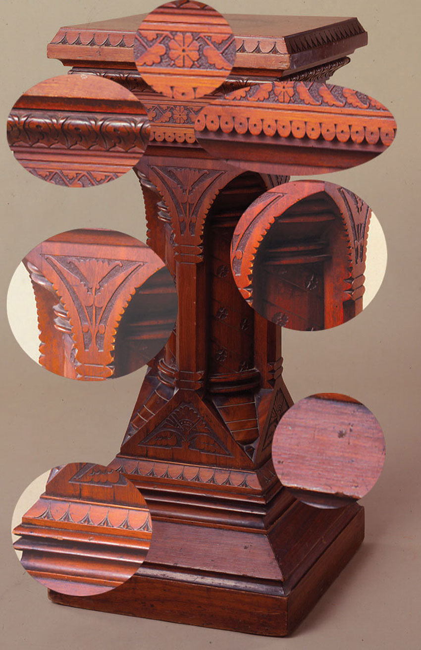
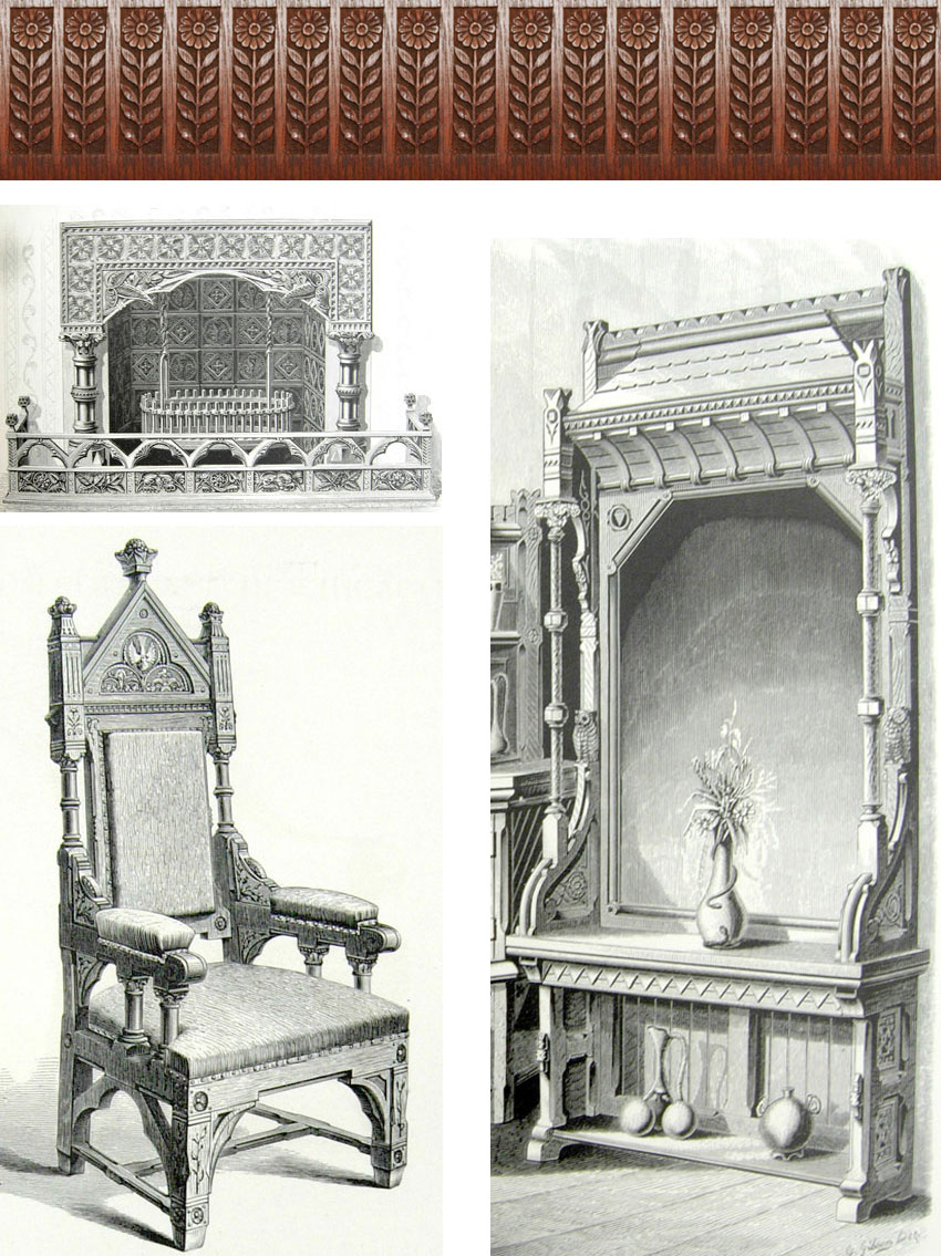
Textile designed by Christopher Dresser
Sunflower chest, Connecticut, 1680-1700 Plate from “Suggestions in Floral Designs,” F. E. Hulme Fresco design, Louis Sullivan 1873 From Lindley Johnson’s grand tour notebook circa 1867-78
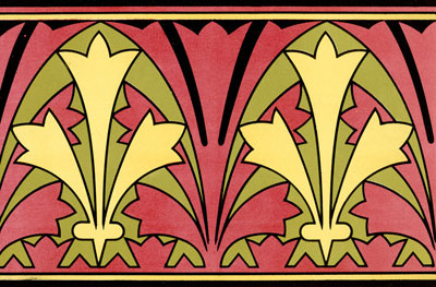

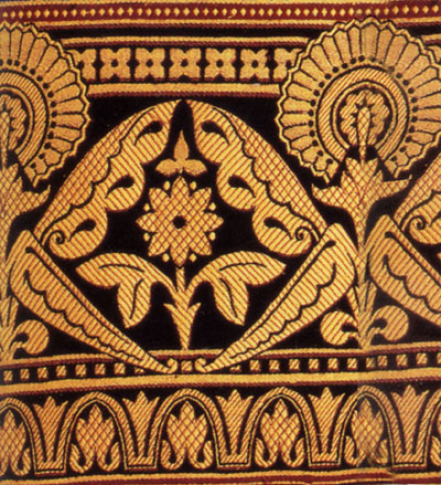
Rigid, linear thinking that takes the flower and paired leaf motif from British designers like Bruce Talbert, Christopher Dresser, and Calvert Vaux to Philadelphia to Frank Furness and then to Pabst pervades most writing about progressive design in late nineteenth-century America. But there’s nothing new under the sun, and this stuff was just in the air, which is not to say that Talbert and Dresser were not influential. They were, but the ideology of fashionable designers along with other less obvious factors combined to form a milieu instead of a one-dimensional timeline. I don’t know if Philadelphia architect Lindley Johnson was struck by the stencils he saw in a French church because they reminded him of things he had seen at home. Neither do I know if the stencils he sketched were real Gothic or from a nineteenth-century restoration, but it is doubtful that the church stencil was influenced by British progressive design. Setting up such genealogies is a fun and satisfying game for scholars, even if it is a very small part of art appreciation. Also doubtful is the idea that such designs were unique to Philadelphia and progressed from there, spreading to all corners of the nation. Sure, Louis Sullivan and Isaac Scott got their starts in Philadelphia, but they do not account for all the Modern Gothic style that permeated Boston, New York, Chicago, Cincinnati, and beyond.
Cover design “Suggestions in Floral Designs,” F. E. Hulme, note “ribbed” background in cartouche Karl Blossfeldt “Art Forms in Nature” 1929
I was bemused by study-day astonishment at the high quality of Pabst’s woodworking skills. Museum professionals should have a broad context with which to compare one woodworker to another and make reasoned attributions. Yet curatorial assistant Jennifer Zwilling couldn’t get over a level of craftsmanship that was perhaps uncommon, but certainly not unique, to Pabst. She was flabbergasted by the medallion in the center of the door of the museum’s tall-case clock (one of the very few pieces actually signed by Pabst), even though it was nothing more than what any one of many well-trained woodworkers accomplished not only in the late nineteenth century but also in the eighteenth century, as many pieces in the museum’s own collections prove. The medallion is also something that could have been made by one of the carving machines available at the time, though everyone is going with the “it’s-art-because-I-say-it’s-art” theory by citing the trade journal assertion that Pabst used no machinery.
Similarly, the Detroit Institute of Arts curator marveled at the book-matched veneer (more properly “quarter matched” if the veneer is in four pieces rather than two) on the top of his museum’s Gibson-family table. Though beautiful, such use of Circassian walnut is hardly remarkable, even for those times. One need only be familiar with the work of A.H. Davenport (1845–1906), who had a great passion for woods with exotic grains and used them with sublime success.
There is another problematic quality issue: So far, we have no way of knowing who carved what. To my eye, the carving on the Philadelphia museum’s clock case and the Met’s cabinet is far superior to the workmanship on Pabst family pieces, some of which are also owned by the museum. It is hard to believe the same person who made the former also made the latter. One theory has it that since Pabst signed the clock case, he must have carved it himself. Still, it has long been standard practice to have different craftsmen make different parts of a single piece, so maybe there was an expert medallion carver who was not the stippler (someone had to do an awful lot of stippling before he could achieve the consistency evident on many of the pieces discussed during the study day) who was not the molding carver who was not the paw maker or the lion carver. These specialists most likely worked at one time or another in other Philadelphia workshops. A Pabst advertisement says, “All furniture after original designs,” but does not specify after whose original designs. Zwilling stretches the concept of original design when she compares the “roof” of the clock case to the pediment on the Furness desk when the case, roof and all, actually follows closely a long-established form specific to tall-case clocks. Focus has been on Pabst originality and little study has been made of his pieces that closely follow earlier designs.
One quick comment about finish: All of the pieces I’ve owned retained the original finish. If you want to see how that finish should look, examine the Met’s cabinet, Boston’s pedestals (although I haven’t seen them in years), or the Sewell Biggs sideboard (unfortunately, the sideboard finish crazed after it got into the museum’s controlled climate). The finish on both the Horace Howard Furness bookcases and Brooklyn’s cabinet was original before they traveled to New York City. Original Pabst varnish or ebonizing appears to be tightly bonded to the wood. It has a very smooth, hard, lustrous surface. I can’t understand why a huge amount of money is spent on supposedly professional conservation, which invariably ends up with a Vilmos finish that looks like thick, shiny caramel on a candied apple. Admittedly, not every piece of Pabst is a museum piece, but original finish should not be tampered with just to suit a glitzy, modern interior.
The study day was touted as a beginning for the planned exhibition. As such, it must surely have been a jump start for the museum, since many old adages were substantiated and a few new bits emerged. For example, the crest on Chicago’s sideboard didn’t seem to fit the Pabst vocabulary until it was related to other pieces with nearly identical monsters.
A conservator made a masterful reproduction of a Pabst column and cited his difficulties as a measure of the difficulties Pabst workers, skilled in making hundreds of similar pieces, experienced. The reproduction column brought attention to something about Pabst’s work I hadn’t much considered: The column was put together with a veneer of bird’s-eye maple over walnut, creating the contrast characteristic of much Pabst woodwork. Bird’s-eye and tiger maple have been used by American cabinetmakers back as far as the eighteenth century and were favored by many Philadelphia craftsmen. When maple is first worked it is a very pale color, which can darken within less than a year if the climate is right. Even so, it is hard to believe that some coloring wasn’t added to the finish to hasten the appearance of the rich honey color associated with maple. Modern art-furniture makers often try to retain the light, bright Crayola “flesh” color (“peach” since 1962!) of the raw wood by slathering on coats and coats of colorless varnish. I wonder if that harsh white tone heightened by dark walnut would have suited even those Pabst clients accustomed to the raucously colored designs of Frank Furness. Certainly period photographs, though black and white, suggest a quieter contrast.
I suspect the museum already has an agenda that will force the results of future research to fit what we already know rather than risk diminishing Pabst by studying all those other cabinetmakers working in Philadelphia when he was in business. I mean, who is going to be brave enough to throw Pabst out of the Met cabinet/Moore mantle equation if we were to learn too much about why the style of some of that carving looks so unlike the style of carving on the commemorative spoons?
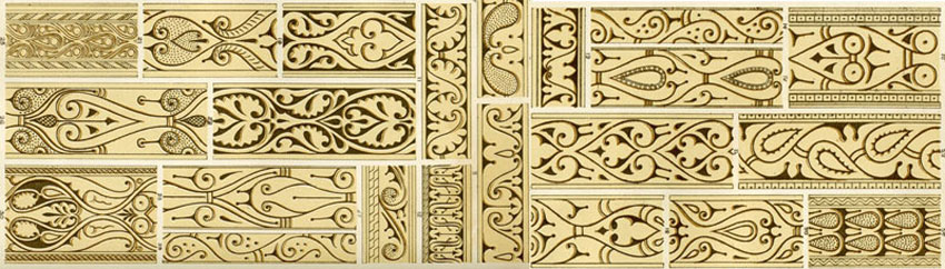
“Arabian” plate from The Grammar of Ornament Owen Jones 1856
Since the study day, I have given a lot of thought to the concept of quality of workmanship as it relates to Pabst. I wonder if a provincial fascination with his connection to universally acclaimed Frank Furness designs is obscuring the fact that, when compared to his peers working in other cities, Pabst is just good, not great. The obvious comparison is to the Herters or Pottier & Stymus, and I would again cite A.H. Davenport. Compare the Pabst tall-case clock to the clock Davenport made for the Albany Court of Appeals: They are both custom made and unique, both use an eclectic bunch of sources for their design, both are carved oak, both have roof shingles, and both are admired as masterpieces by some decorative-arts types. That’s it, though! The quality of the Albany clock is far superior to that of the Pabst clock and makes me wonder what the standard is. I might be faulted for comparing a small shop to a larger company, although I don’t think (in this case at least) size has anything to do with it.