EDWARDS' NOTES
ROBERT REVIEWS
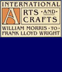
. . . and reprinted from LIFE BY DESIGN

White Pines Pottery; the continuing arts and crafts experiment by Jane Perkins Claney
The first definitive assessment of White Pines pottery was written in 1984 by Dr. Jane Perkins Claney for "Life by Design" the Delaware Art Museum's exhibition about the Byrdcliffe Arts and Crafts Colony. It is reprinted here in PDF format. We have a limited number of catalogues from this seminal exhibition available for $25.00.
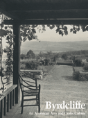
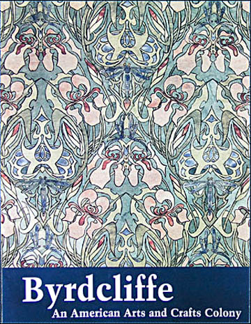
Byrdcliffe: An American Arts and Crafts Colony
Years of research and preparation went into “Byrdcliffe: An American Arts and Crafts Colony,” which opened June 7th in Woodstock, New York as a part of the “Byrdcliffe Centennial Celebration 1903-2003” presented by the Woodstock Guild. The exhibition was housed in three buildings in the center of a town long known for art activity that got a jumpstart when Ralph and Jane Whitehead opened their mountainside colony in 1903. As handsome as the installation was, it made no sense because there was no catalogue and the labels (reproduced on a checklist) offered no clue as to why a particular object was on display. The objects were spread without order throughout multiple remote galleries.
This confusion was the result of the many permutations the exhibition went through to get to this point. Tom Wolf began research for the project before Carla Smith became the guild director in 1997. At the time, the scope was limited to a local audience because few in Woodstock were aware of the importance Byrdcliffe had taken on in the marketing and study of the American Arts and Crafts movement. Interest within the market has been developing steadily since the 1984 Delaware Art Museum exhibition and scholars looking for fresh material about American decorative arts found a mother lode in the Whitehead archives given to Winterthur in 1991. Even so, Smith says ”This [the guild exhibit] is the first comprehensive exhibit organized by scholars to look at the history of Byrdcliffe.” I wouldn’t presume to describe myself as a scholar, but the late Roland Elzea was responsible for bringing Byrdcliffe to Delaware and he was a scholar of international renown. Smith made a valiant attempt to pull many disparate elements together in a grant proposal and applied for outside funding with only enough success to keep the project afloat. In the United States, punditry is valued more highly than intrinsic beauty among money sources like NEH and NEA so I tried to get Smith to recruit some of the old Arts and Crafts war horses like Becky Lawton and Cheryl Robertson to lend credibility to her cause. Lawton bowed out of the fray and before Robertson was completely on board, another character appeared in the cast.
Nancy E. Green of Cornell was still riding the crest of the Arthur Wesley Dow brouhaha generated in part by her 2000 exhibition “Arthur Wesley Dow and American Arts & Crafts.” Stephen Grey helped her to appreciate the attention the Byrdcliffe furniture in her show was getting. Deciding it was time for a re-evaluation of the colony, she more or less took over from the guild in 2001. Green and Wolf began with little knowledge of the Arts and Crafts movement in general as both are more attuned to the fine arts. Still, they attempted to assemble a group of advisors who were well equipped to provide what they didn’t know: Robertson was to handle the architecture. Ellen Denker was to re-write the pottery story told in the 1984 catalogue by Jane Perkins Claney. Wolf would reveal his research about the fine art. I was to find some new stuff to say about the furniture. And Green? Well, I have never been quite sure what Green was to write about although she went to England to learn more about Ralph Whitehead than has already been published. After one meeting of all the consultants and with no object list for guidance, everyone set to work to meet a May 16, 2002 essay deadline. Later on Heidi Nasstrom Evans was asked to write about Jane Byrd McCall Whitehead’s considerable contribution to the colony’s activities.
By fall of 2002 few essays had been submitted and the consultants got a letter saying the catalogue would not appear until 2004, which left the guild in the lurch.
The show is being touted as the "largest exhibition ever of Byrdcliffe Arts and Crafts." If size really does matter, the 152 objects listed on the checklist trump the mere 112 objects listed in the 1984 Delaware Art Museum catalogue. There are other measures like relevance. The DAM show had 23 examples of furniture production, the Cornell show has 7. Those hoping to see a representative grouping of Byrdcliffe furniture will be disappointed. Most of the best examples are now in museums. Such institutions place many restrictions on where their precious possessions go and how they may be displayed. Certainly the basic facilities in Woodstock could not meet museum regulations. However the Whitehead heirs still own pristine examples of furniture and more was available from other private collections. The guild and the Woodstock Art Association have important pieces that were not displayed including the dining table and chairs
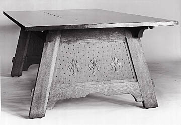
made for the Whitehead’s use at White Pines and the only decorated picture frame that can be attributed to Byrdcliffe. Why, then, are so few examples of furniture included in the exhibition even though the primary audience is the Arts and Crafts crowd and their primary interest is the furniture? There are two reasons. First: without a catalogue, the Woodstock version of the show is a shadow of the version planned for 2004 under the Cornell aegis. Second: Wolf told me he thinks the fine art is more interesting than the furniture while Green thinks the Dow connection is paramount so the show is heavily weighted with two-dimensional art.
The exhibition lacked focus because it was not just the anniversary show it was first intended to be. The Cornell consultants were given 1929, the year Ralph Whitehead died, as a cut off date for research for the “real” 2004 show. Many of the objects in the Woodstock version of the show were completed well after that date—fine if you’re celebrating all one hundred years of art in Woodstock. Were that the intention, where are the Yasuo Kuniyoshis, the Milton Averys, the Konrad Cramers, or the Hunt Diederichs? While not officially a member of the colony, Diederich stayed at White Pines with his friend Ralph Whitehead. He left behind unfinished ceramic chargers and sheet metal weather vanes with price tags still dangling from them.
Green and Wolf have tried to give the Byrdcliffe story a feminist spin. Green says Ralph Whitehead "successfully encouraged women working within the sphere of decorative arts" because "he did not pigeonhole them into gender-oriented crafts or assign credit for their work to their male collaborators." This statement appears in a handout beneath an illustration of a Byrdcliffe logo credited to Ralph Whitehead.
Jane Whitehead’s book of logo designs and other preliminary sketches at Winterthur suggest that she had more to do with the final design than Ralph had. Green goes on to say “Men, too, most prominently Whitehead himself, worked in the traditionally female fields of weaving and pottery design.” This off-the-top-of-one’s-head kind of reasoning is full of holes. If weaving and pottery design are traditionally female fields anywhere; they are not in British or American culture. A more cynical interpretation of Whitehead’s encouragement would note that he was a womanizer. Indeed, a scandalous liaison in California could well have been a factor in the founding of Byrdcliffe. After he left Santa Barbara, his wife, at least, was convinced that Ralph was encouraging more than weaving with Marie Little, a strange bird he had taken under his wing in Woodstock. Jane refused to come East until Ralph got “that woman” out of Byrdcliffe. Jane also berated her husband for dallying with Edna Walker and Zulma Steele. The latter later married Neilson Parker and moved away from Byrdcliffe.
Wolf has the idea that Byrdcliffe and Woodstock were unusual because so many single women and female couples chose to live and make art in the area. Here mention of Roycroft and East Aurora might be relevant. Hubbard’s wife Alice wrote a number of feminist tracts; single women bound and illuminated books, tooled leather, and tapped out copper items in the Roycroft shops. In fact, single women dominated many art communities and the reasons were not always feminist.
Provincetown, where Charles Hawthorne began teaching art in 1899, is another example. Single females dominated his classes and from then to this day the town beckons lesbians, artistic or not. Both the Provincetown and the Woodstock art communities were friendly to queers of any gender. If Alf Evers manages to publish his biography of Hervey White, we might at last have a balanced assessment of pansexual activities among Byrdcliffe denizens. White of the founding four was a homosexual as is already known, and there is much beyond the letters Whitehead wrote to his “Nicolo”(Hervey White) to suggest that some Byrdcliffe men were engaging in creative male bonding. Carl Linden and the mysterious Captain Frits van der Loo both lived with handsome Hervey

before they all got married. So, while it might be notable that there were lots of single women making art in Woodstock, it is not remarkable. Maybe all Whitehead’s earnest theorizing was nothing more than a cover-up for his penchant for screwing around. After all many people have tried to change the world to make it fit their personal needs—consider the Pre-Raphaelites and William Morris or C. R. Ashbee. Rossetti, Burne-Jones, and Morris were busily promoting romantic notions of chivalry and high-minded socialism while just as busily cuckolding each other. Ashbee would have been just as great a designer without his interest in communing with young males.
Zulma Steele was one of the most accomplished artists producing during Byrdcliffe’s early, active years.
Her work is well represented in this show, but much of it has little or no connection to the theme Nancy Green defined. Steele’s much published Art Nouveau repeat pattern is given great importance by its use on the cover of the handout folder (the owners claim it will also be the cover of the projected book.) It has been listed in exhibitions as "Dragonfly Wallpaper" and given a date of circa 1905.
If there were a credible reason to suppose this to be a wallpaper design of that date, it would be helpful to know more about wallpaper production at Byrdcliffe. My research suggests that the dry, dated style of this design and another sheet of plant studies (dated 1910 in the Dow catalogue) is actually the result of student exercises, which were part of the curriculum of every art school in America and abroad during the decades on either side of 1900. As such, they might be significant in a show about Steele. The fact that an iris (a favored flower of the Whiteheads) appears in these schoolgirl efforts is not enough to warrant their inclusion in an exhibition about Byrdcliffe. Only the present owners will benefit from reproducing the wallpaper design on the cover of the catalogue.
Wolf claims that another Steele painting shows a Byrdcliffe art class. The mountains look far too Alpine to be the gentle, forested Catskills and the ladies sitting pretty in flounced white summer frocks are not dressed in the plain manner evident in countless period photographs showing Byrdcliffe women at work. Another impressive painting called “Autumn Landscape” adds to the luster of Steele’s reputation but was made too late to add to an understanding of Byrdcliffe. So too the examples of her pottery, which were not necessarily made before 1929 at the Byrdcliffe potteries.
Curators Green and Wolf included many other works without a specific Byrdcliffe connection perhaps to tweak the known facts a little so the history will seem more interesting. Edmund Rolfe taught metalwork at the colony for a short time. Wouldn’t it be lovely if his jewelry displayed in this show were made in the Byrdcliffe shops? Wouldn’t it be nice if Bolton Brown’s pots had been made before 1929 in the Byrdcliffe pottery? How can we be sure the monogram on two small works is “V. B.” for Vivian Bevans and not “W. B.” as it so obviously appears to be?
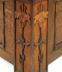
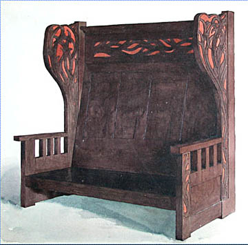
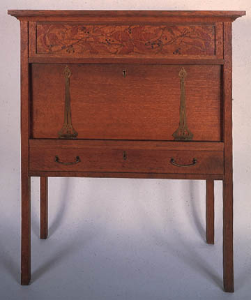
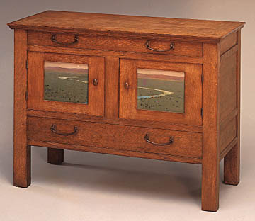
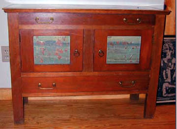
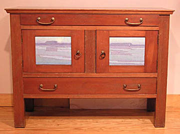
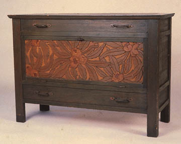
Those of us who think Byrdcliffe furniture is more interesting than the pleasant but retardataire paintings will be disappointed to discover that knowledge about its production has regressed since 1984. I thought we knew who designed the decorations for most of the furniture, but five of the seven pieces in the show are listed as anonymous. The exceptions are an oak cabinet listed as having been made by Hermann Dudley Murphy and a settle listed as being by Dawson Dawson-Watson (Edna Walker made oak-leaf designs for the same bench.)
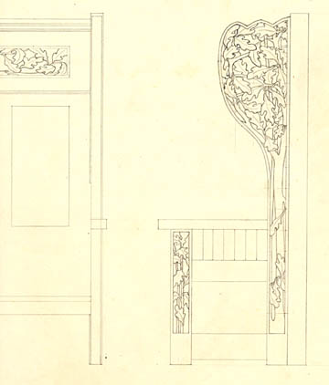
There is no documentation to suggest that either man actually made furniture in the Byrdcliffe wood shop. The iris desk in the show is listed as being by anonymous. A drawing of the same desk as well as designs for the iris decorations bearing Steele’s signature exist to document the designer.
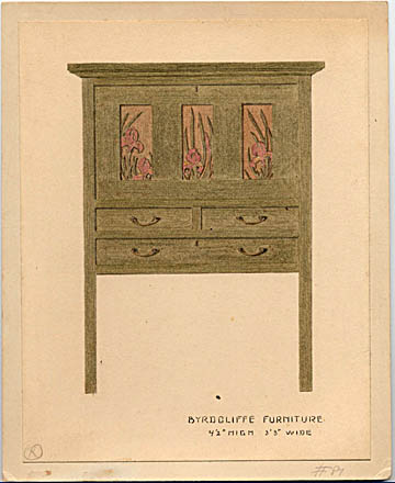
Even when plant studies are not signed, a trained eye can see the differences in the styles of Edna Walker and Zulma Steele. It is not likely that both women worked on the same design yet Steele’s ?woodbine? drawings (later used on her "ampelopsis desk") are listed as "Zulma Steele and Edna Walker."
An old, unsubstantiated notion that one of the reasons the furniture did not sell was because it was heavy and could not be hauled off the mountainside to the nearby train station with ease continues to be dragged out. Only five or six Byrdcliffe pieces were cumbersome enough to make transportation problematic and at least one of those was sold and moved in 1904. At that time moving heavy objects about was an everyday job. Teams of oxen moved huge stones out of fields and colossal granite columns were dragged to the top of Overlook Mountain to enhance a hotel façade. Mrs. Whitehead’s monstrous Steinway piano made the trip up hill to White Pines along with several large pottery kilns.
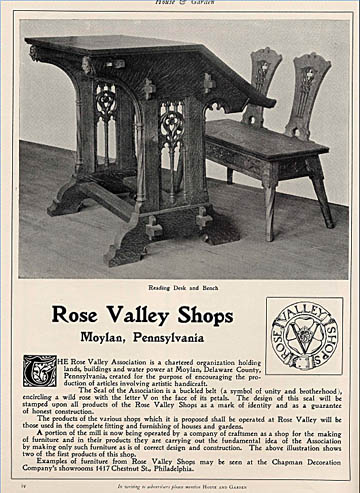
According to Wolf, another reason the woodworking enterprise failed was because "the expense of producing the work was prohibitive." He goes on to say "It was undersold by Stickley and Roycroft, who were doing things comparable in quality more economically." Green adds, "The furniture has a lot in common with the shape of a Stickley piece." Both Stickley and Byrdcliffe furniture usually have four legs to stand on, but this analogy has none. Byrdcliffe furniture cannot be likened to mass-produced Craftsman or Roycroft products. It is more aptly compared to Will Price’s Rose Valley furniture. Price managed to sell quite a bit of his furniture at prices nearly identical to those for Byrdcliffe even though the latter was far cheaper to build. It didn’t cost much to build Byrdcliffe cases or to have the simple landscapes painted on the panels. Carved Byrdcliffe panels are rudimentary compared to the elaborate Gothic carvings used at Rose Valley. The difference in sales was doubtless due to Price’s aggressive national advertising program.
As far as we know, Whitehead never advertised his furniture.
One review of the exhibition states, “Many scholars have credited the unique [Byrdcliffe] furniture panel designs to the influence of Arthur Wesley Dow (1857-1922), who taught at Pratt and sent students Steele and Walker to Byrdcliffe.” This oddly qualified statement is like saying, “Many scholars have credited the unique qualities of human beings to Adam and Eve who passed their genes on to Cain and Abel.” One is curious about who are the “many;” what the focus of their scholarship might be; and which unique aspects are being considered. Wolf has called Byrdcliffe panel designs “pictorialist” because he says the plants and landscapes look like what they are. He looked at the painted furniture of William Morris and found that most of the early pieces included images of human figures dressed in medieval garb. This led him to the conclusion that Byrdcliffe panels are unique and innovative because they have no figures and often the design of one panel seems to continue behind the door frames into a second panel. He ignores the furniture designs of Baillie Scott, as well as antique Italian furniture that Ralph Whitehead knew and loved so much. Admittedly, a landscape painting without figures is difficult to find before the 19th century and because Will Low’s 1882 cabinet (now in the High Museum) incorporates large female figures in the diptych on the doors, Wolf would rule it out as a precursor. But there are certainly late 15th and early 16th century Italian chests that are mounted with panels in which a single horizon passes behind the framing of the case just like the river scene Hermann Dudley Murphy painted for a Byrdcliffe “chiffonier.”
Many scholars cite these Murphy panels as an example of Dow’s influence.
Green, who included the cabinet in her Dow show, goes so far as to suggest that the scene he painted might show the Ipswich marshes since both Murphy and Dow had homes near there. This ignores the fact that Murphy has depicted a substantial river flowing through a vast mountain-edged valley (perhaps the Ashokan River that was once visible from Byrdcliffe) and not Dow’s iconic Blue Dragon, a tidal creek that wound through swampy lowlands in Massachusetts. Murphy was not a Pratt student sent to Byrdcliffe by Dow.
Picture frame making was supposed to provide income for the colony. Only a pile of very plain oak frames remains as testament to that project, which Wolf glorifies by describing another object with questionable Byrdcliffe associations. Dawson Dawson-Watson made a painting of wildflowers and provided it with a frame on which the names of the flowers are carved. As the painting is dated 1903, Wolf assumes Dawson-Watson depicted the Hudson Valley. In his lecture at the Woodstock opening he suggested that the frame is evidence of important innovations coming out of Byrdcliffe. He interpolates, ”Together frame and painting make a quintessential Arts and Crafts object, its imagery based on local flora, with fine art (painting) inextricably united with craft (the frame) into a total unity.” Can’t argue with that? For as long as there have been artists, there have been frames designed to create the same “total unity.” Thomas Eakins famously designed frames carved with images of objects used by his portrait subjects. The gold leaf on these frames was sometimes laid directly on open-grain indigenous oak, but are these frames also Arts and Crafts? Adding up elements neatly supporting a theory while leaving out the messy facts is a fun game.
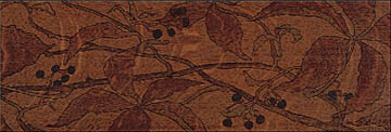
A final consideration must be the condition of the Byrdcliffe furniture shown in the exhibit. A large oak cabinet has painted panels showing bare tree branches against the moon.
The design was barely visible before the panels were restored especially for this exhibit. Nothing on the label indicates that the panels, as they are, represent a conservator’s interpretation of the original paintings. When I was there, several viewers were admiring the muted colors thinking they were original. The iris desk also in the show represents another approach to restoration. A decision was made to try to recreate the look of a freshly minted piece of Byrdcliffe because new cherry (the checklist says ?oak?) had to be used to repair the desk front. The original stains, once hidden under a coat of white paint, had to be blended with the modern stains. The result approximates how new stains on freshly cut wood might have looked in 1904, but there is nothing on the label to interpret the surprisingly vivid colors. The Murphy cabinet once had a more intense green stain and the hanging lily cabinet is in deplorable condition. One can be glad that the reputation of Byrdcliffe furniture does not rest on what is now on display in Woodstock. Hopefully the 2004 version will include some of the masterpieces although, apparently, it will also include another heavily restored piece: a recently discovered cherry chiffonier with a modern varnish and blue landscape panels that have more inpainting than original surface.
The addition of another landscape cabinet will shift the apparent balance making furniture with painted panels seem more important than pieces with carved panels.
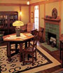
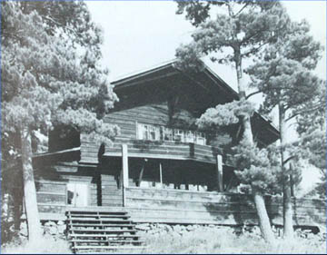
The best aspects of the Woodstock venue won’t travel. White Pines, the Whiteheads’ Byrdcliffe home,
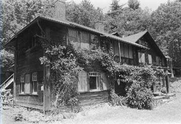
is open to the public and has a new display that goes a long way towards explaining the downtown show. One may also tramp around the entire Byrdcliffe campus. There is a program to restore the Whitehead home. As it is, one can imagine the melancholy lives of those who occupied the dark interiors. But curators of the show have not been content with the wonder that these prosaic wooden buildings still stand, they have tried to force the architecture into the “radical,” “innovative” (those buzz words so essential to exhibition funding) realm. Green compares them to “marble and gilt” Newport mansions, which is as inappropriate as her comparison of Byrdcliffe furniture to Stickley’s Craftsman production. She doesn’t get that the Arts and Crafts movement is not about lack of marble and gilt. Vanderbilt’s fabulous Biltmore was essentially an Arts and Crafts experiment. The same robber barons that built the Newport mansions built rustic “simple” Adirondack lodges, many of which were based on the designs of Swiss chalets.
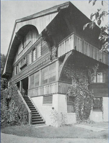
On the other hand, the Greene brothers’ mega-bungalows were embellished with silver and precious woods and even gemstones. What happens when 1903 Byrdcliffe buildings are compared with McKim, Mead & White’s shingle-style houses from the 1880s (William G. Low house) instead of their beaux-arts mansions? How radical are they when compared to the contemporaneous residential work of Frank Lloyd Wright?
In architectural design as in Ruskinian philosophy, Ralph Whitehead was a parrot and plagiarist. In my mind, that doesn’t compromise the significance of Byrdcliffe. Why do we have to inflate its importance by making every aspect radical and innovative? It is enough to marvel at what actually happened.
Many Arts and Crafts scholars and aficionados who credit the unique reputation Byrdcliffe now enjoys to the furniture made at the colony will want to have seen both the Woodstock exhibition (the Guild segment closed September 2, 2003) and the 2004 exhibit that opens in Milwaukee on June 25. The Milwaukee museum owns fine examples of Byrdcliffe production and their new wing is a wing like the wing of Byrd.
SOURCES AND INSPIRATION: BOSTON AS A BEACON FOR THE AMERICAN ARTS AND CRAFTS MOVEMENT
NYU Appraisal Studies in Fine and Decorative Arts Conference in Boston, June 19-23, 2002.
I hadn’t been to an NYU Arts & Crafts conference since the first in New York City in 1999, so I was anxious to see how it had evolved. This year ’s conference was called “Sources and Inspiration: Boston as a Beacon for the American Arts and Crafts Movement.”
By June 19th, a heat wave had engulfed the city of Boston. The conference began on a hot night with a reception in an unventilated room under the roof of Trinity Church where there was no air-conditioning. Opening remarks turned into speeches that all seemed to start with, “As I’m sure you’ll hear later in the conference….” One theme that, as it happened, was heard several more times during the next days was that Trinity resulted from a unique “confluence of artisans.” Right then and there, standing at the back of the room with sweat pooling the ink on my notebook, I jotted down my first quibble. Although I didn’t then know it, that note codified a systemic problem in most of the following presentations. If you don’t point out that all churches for all time have relied on the best skills of a confluence of artisans, then you make a case that this was a new development specific to the Arts & Crafts Movement.
After the welcoming remarks we were invited to join one of several guided tours of the church…or to stick around for more refreshments and to network. Uncharacteristically, I opted for the latter because I thought I knew the church pretty well and, being in a born again mood, I wanted to try something new by working the room. Soon I was the only one keeping the overheated waiters passing food so I tagged along with the last tour.
Our dynamic guide trooped us all along the outside showing us Richardson’s favorite view of the building. >> ( “Richardson’s favorite view of Trinity Church”) She told us how the mirrored Hancock tower and the Robert Stern building respected and complimented the church, the tower with its angled façade and reflected reiteration of Trinity and the Stern building with the bits of checker board pattern shoved between rows of post modern Palladian windows. >> (“Robert Stern’s building attempts to pay homage to Richardson’s masterpiece” )I took some pictures, but don’t think I’m going to let you be the judge. During most times of day, the Hancock’s mirrored siding bathes one side of the church exterior with either a pallid or lurid glow depending on where the sun is.>> (“Note the deconstructing vertical bands of light on the walls of the church. The sun is actually setting on the other side of the church.”) If overwhelming Richardson’s art with mere size didn’t satisfy the architects’ ego, they managed to alter his work by painting it with ungodly light. Stern’s building is better in that it doesn’t relate in any way except for the silly pattern quote. >> (“A post card view of Trinity Church circa 1910.”)
We heard all there was to know about Trinity and then, in the end, trapped in the choir balcony, we almost heard it all again because our lively, well-informed guide couldn’t figure out how to stop so she started over. I was glad I didn’t have to be the first to stand up and bolt for the iron-strapped door.
The conference began bright and early but not on time Thursday morning. Lisa Koenigsberg’s introduction about “complexity and contradiction” set the conference parameters so wide that “American Arts and Crafts Movement” could have been left out of the conference title: “ Sources and Inspiration: Boston as a Beacon for Stuff That Happened From Sometime After 1850 to About 1950.”
Putting your best foot forward is supposed to be a good thing. Putting Alan Crawford up first gave rise to great expectations. I can’t say why I have always liked and respected Alan. Until this conference, I hadn’t met him or even read much of his work on C. R. Ashbee. I must have formed my opinion when we exchanged a couple of short letters about an Ashbee brooch Jane Whitehead owned.>> (“Jane Byrd McCall Whitehead wearing a silver and garnet brooch designed by C. R. Ashbee.”) Unlikely as it seems, his disarmingly gentle charisma emanated from the couple dozen words in his letters. Anyway, his first slide made him my hero. The slide showed a sign over his desk that read, “Try not to mention the Arts & Crafts Movement.” a caution he meant to remember while working on a history of the unmentionable.
Crawford admitted right away that the only thing he could say about Boston was that he was there. His theme was his own evolution as a historian of the Arts & Crafts Movement. He felt he had reached a point where merely examining the products of the Movement was not enough to tell the history. He suggested that most decorative arts history had been written from three perspectives. Namely, as a “Spaceman” who looks at an object as if it had fallen from an unknown planet; a “General” who lines up facts and adds no subjective interpretation; and a “Butterfly Hunter” who dissects his prey until it is unrecognizable. He didn’t want to resort to the generalist’s inventory that tells history by setting up products from the era in a necessarily arbitrary chronology. These days two endearingly crude chairs Morris and Rossetti made for Morris’ own use offer a convenient Big Bang Theory for the Arts & Crafts Movement.>> ( “One of a pair of chairs made by William Morris and Dante Rossetti”) They represented many ideas that became important to Arts and Craftsmen. They were made and painted by the person who would use them and they even had the loose-pin joinery to identify them for later spacemen. It was not so long ago (1971) that Gillian Naylor started her seminal history of the Arts & Crafts Movement without those now iconic chairs—a new discovery can upset the whole apple cart. Crawford set a paradigm that the following lecturers could not hope to escape.
Crawford would rather be a “biographical historian.” I knew what he meant, but I didn’t understand what he meant until I read Felicity Ashbee’s book about her mother, Janet. In Janet Ashbee Love, Marriage, and the Arts and Crafts Movement, the craftwork of Felicity’s father Charles is hardly mentioned and is certainly not analyzed. “CRA” is absent most of the time and the experiment at Chipping Camden was over early on. After all these years of reading dissections of the theory of the Movement and looking at its physical results, I finally have a much clearer idea of what the Movement was to those who were involved. As I read it, CRA didn’t bring those young men together at Chipping Camden because he already believed in the Arts & Crafts Movement. He wanted to surround himself with young men and found that the Movement offered a viable context. I hadn’t realized that the way the objects made by the Guild of Handicraft looked had much more to do with the kind of man who was willing to follow Ashbee from the city to the alien environment of a rural village than it did with the writings of theorists or art-school-trained stylists.
It probably takes dinosaurs like Crawford and me to think about thinking about the Movement. Scholars just discovering Arts & Crafts are often too fascinated by a niche in the pantheon. They rely on thoughtless cliches to describe the larger structure. In addition to banning mention of the Movement, I would be happy never again to hear “shoddy craftsmanship,” “democratic tenets,” or, for that matter, Gustav Stickley. Gustav Stickley’s name is invoked to serve as a symbol for the whole American Movement except the part the neophyte is studying. Small subjects are necessarily fodder for the thesis mill so it is nice that students can get all excited about obscure lady artists who aped Arthur Wesley Dow. While I certainly enjoy travelling these byways on my own, they are probably not the best routes for learning about appraising fine and decorative art at a conference.
The NYU conference was a forced march led by Lisa Koenigsberg, herself among the newer breed, which hasn’t had time to develop a proper amount of cynicism. Too many talks were jammed into each day and too many talks were just laundry lists. The days usually began somewhat on time at nine in John Hancock Hall, an uncomfortable room not meant for enduring hours of lectures. Even had the slide projectors been functioning properly, the slides were difficult to see because daylight streamed across the projection screen. That would be the only daylight attendees would see for the duration. There we were at Copley Square, the epicenter of Boston Arts & Crafts according to the conference. We had paid $475.00 just to register and quite a bit more for room and board. We were holed up in a dark room settling for a second hand experience of what happened in this city. By the lunch hour lectures were running past schedule. If you bought the box lunches provided by NYU, perhaps there was time to sit in the conference center lobby and consume it. If you wanted to go outside to experience what you were hearing about inside, you didn’t have time for even a Big Mac.>> • >> (“Two Richardson buildings are just around the corner from Trinity Square: the 1869 Brattle Square Church and the 1879 rectory for Trinity Church.”) Oh, sure, you could miss the first lecture of the afternoon, but how would you know if the one you missed would be the one that saved the day. As it happened, Crawford’s was the only one not to be missed.
I couldn’t help but file the speakers into Crawford’s categories: the Spaceman, the General, the Butterfly Hunter. The inventory listers were mostly Spacemen. They showed slide after slide of pots and books, picture frames and furniture, more pots and gardens without seeming to have looked at what they were showing. While talking about the idea that conventionalized two-dimensional motifs were the only appropriate way to decorate the sides of a pot, a speaker showed a superb Marblehead vase with a border comprised of repeated, framed perspective views of a field with haystacks. The contradiction helped me see this rather staid vase in a fresh way—it became amusingly surrealistic.
Seeing surrealism became a game to keep myself awake. I saw it in some LaFarge stained-glass windows where substantial classical architecture was rendered in translucent layers of glass. A delightful conceit that—a window that cannot be seen through showing stone columns through which light pours. How’s that for Arts & Crafts truth to materials?
Next we were asked to credit the Arts & Craftsman’s return to natural nature while we viewed geometric hedges surrounding beds dotted with ubiquitous toy-like lollipop trees. If those designers had sought not to control nature, we wouldn’t find a pair of such tortured trees in pots at every doorway or marching in rows through interior frieze stencils and wallpapers. >> (“Potted bay trees appear on the cover of a 1902 House and Garden magazine.”) I suppose one might be charitable and imagine the speakers to be addressing the conference theme of complexity and contradiction.
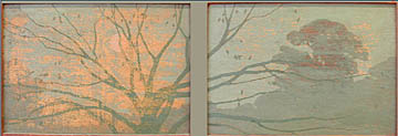
Confusion might well have been a third “C”. Terms were variously interpreted from one lecture to the next: “naturalism” was good in a garden but bad on pottery. “Realism” and “naturalism” were conflated as Marilee Myers attempted to explain Dow’s rejection of “Victorian principles of naturalism.” I think she equated “realism” with those very realistic cabbage roses so many ladies were painting on china plates heedless of the rantings of Robineau, Dow, and so many others of the era’s Martha Stewarts. But what of LaFarge’s extraordinarily realistic stained glass peonies that had just been touted as exemplars of the Arts & Crafts Movement. I was looking at some tulip poplars while walking the dogs here at home the other day. While observing the real thing, I was struck by how realistic and naturalistic the Dow student Zulma Steele had made her leaves when she designed panels for a Byrdcliffe cabinet. It seems to me that her designs have precious little to do with textbook theories about abstraction or conventionalization and a lot to do with careful representation of real nature.>> (“A detail of a tulip poplar panel designed by Zulma Steele for a Byrdcliffe cabinet.”)
The “Generals” snapped a drowsy audience to attention. Beverly Brandt’s clearly declaimed, precisely timed, “Don’t tread on me” presentation about the architects of the SACB was refreshing. I like the way she whips those guys into line. Even though her material had been published and pondered several times during her decades of research, it would be ungallant to place Ms Brandt among the dinosaurs. She’s a piece of mischief because she knows it would not be PC to notice that she always is a knock out in a dowdy Arts & Crafts crowd.
I love typography, but, as “General”John Kristensen opined at the outset of his talk, it is not a subject that can be explained with slides that make tiny bits of type six feet tall. Still, Kristensen grudgingly let an army of Phillistines trample through his arcane, chaste world of the printed page. There was a gasp at the blasphemy when he struck down the page designs of William Morris.>> (“The Kelmscott edition of News from Nowhere is to the Arts & Crafts Movement what the cross is to Christianity. However beautiful some elements of its decorated pages may be, their combined effect hardly suggests “an epoch of rest”, which is the book’s subtitle.”)
For the weekend we were able to move to a real lecture hall at Harvard’s Sackler Museum. It was perhaps unfair to those who had had to present their work in the Hancock conference room with its hard seats, flat floor, bad lighting, malfunctioning slide projectors, and minimal air conditioning. But, for me, the move made the rest of the schedule bearable.
There were no more “Generals,” a few more “Spacemen” listers who failed to connect what they were saying to what we were seeing on the projection screen, and then there was a “Butterfly Hunter” who, upon putting together his dissected quarry, forgot the wings and so chronicled a new species. It sounded like Ned Cooke was suggesting that Mission furniture somehow blew in to Boston as a full-blown style at the turn of the century and was quickly rejected by Boston Brahmins in favor of Colonial Revival. Parts of his premise would seem to be true. He showed slides of Boston based furniture retailers like Leavens, Cobb/Eastman, and Paine that showed suites of Mission style furnishings. >> (“This William Leavens & Co. ad from a 1909 Country Life in America does not use terms like “Mission” and “Arts & Crafts” to describe their furniture. The Boston-based manufacturer perhaps seeking a wider audience, claimed that the dressing table “on the straight line order” could be used in “the cottage or city home.”) He did not mention that these ads were published in magazines that were circulated nationally like House Beautiful, House and Garden, or Country Life in America. To do so would have diluted his idea of regionalism. A survey of the photographs of interiors found in the same magazines where the ads appeared would reveal that Mission never took hold in Boston or anywhere else. After 1920, when it became the cheap solution to furnishing mass-produced bungalows, Mission didn’t often appear in upscale shelter magazines. Even then, not many households, rich or poor, were done up completely in the later, more dreary version of a style that was decades old.
I don’t think high society in Boston or anywhere else consciously rejected Mission furniture--they never considered it. Colonial Revival continued to flourish as it had since the British were ousted from the colonies—it hardly needed Arts & Crafts morality to keep it going. John Scott Bradstreet lugged New England heirlooms west and installed them among his wild, Orientalist creations. Louis Tiffany designed his own rooms in his family’s 1882 New York City house incorporating “Colonial” antiques. >> (“A Colonial Revival interior designed by Tiffany Studios before 1910.”) Philadelphia’s Frank Furness allowed Main Line families to keep their cozy claw-foot furniture beside the leering dragons he tethered to fireplaces. In any Eastern city from Boston to New York to Philadelphia to Baltimore to Charleston and in between and beyond, the rich who didn’t have “Colonial” family heirlooms chose fancy interpretations of Louis XV and LouisXVI. Thus the style of the “Gilded Age”, which paralleled and was certainly more pervasive than Arts & Crafts style, showed up in residences large and small.
Cooke began his presentation with slides showing ads for mission furniture and called the style “prototypical” implying that the work of makers like Gustav Stickley represented the Arts & Crafts style. He marched forward from that point mentioning Boston-area makers like the William F. Ross Company, but he never looked back to give an idea of the prevailing styles with which mission would have had to compete. Most notably, there was no mention of the work of A. H. Davenport.
I’m all in favor of a narrow definition of American Arts & Crafts, but lately and specifically at this conference, an all- inclusive definition is fashionable. The works of H. H. Richardson and even the earlier Memorial Hall at Harvard were featured at the conference. >> (“Harvard’s Memorial Hall was designed by William Robert Ware and Henry Van Brunt in 1865.”)The 1920s work of Wallace Nutting and the 1930s work of Charles Connick showed up on the other end. Davenport made furniture for many Richardson buildings as well as for the architect’s offices. Davenport kept up with the prevailing styles and even offered furniture that was as simple as Mission well before Cooke’s ads began appearing in print.>> (“Sketch for the Davenport version of a Morris chair, which they called a “tip chair” ”) The important difference is that his designs were not subservient to some theoretical message. He didn’t resort to the flim- flammery of rough finish on quartered oak or loose pin joinery, which was all too suited to mass production. If he used quartered oak (and he did) it was of a gorgeous, select quality that could never have been found in the mountains of oak that supplied Grand Rapids and Stickley. If he decorated his furniture with carving, there were no added chisel marks to make it look like hand carving. He relied on time-honored methods of cabinetmaking to make furniture that had but one message: high quality.
Cooke went on about how carving was associated with handwork and was another reason plain Mission was rejected by the rich in Boston. However, the carving machines available at that time were capable of results that even today require expertise beyond an average consumer to distinguish from hand carving. I would suggest that a weakness for fancy stuff runs through all classes everywhere. One needs only to glance at any issue of Architectural Digest to see how few people choose Breuer over Baroque or Mondriaan over Monet. As always, relatively few are ready to wear the hair shirt of sterile, if stylish, simplicity. Laws were once made to keep people from wearing too much lace, a certain embroidery stitch, a certain yellow, or having very large mirrors. Without the law behind them, American Mission marketers had to try to impose the tyranny of good taste and right living on middle class consumers—it was a tough fight that was ultimately lost in Boston certainly, but also across the nation.
While I was bitching about the lectures to another Arts & Crafts dinosaur, I was told that Cooke knows what he was talking about but wasn’t saying what he meant. I have great respect for Cooke’s knowledge, and particularly for his published iconoclastic interpretations of the Arts & Crafts Movement, but hearing a presentation robs one of the clarification provided by introductions and endnotes.
After the first lecture on the first day, there wasn’t time for discussion whereby a listener could ask for clarification or challenge a premise. Too often throughout the whole conference, statements sailed past unquestioned. If they had been true, they would support the assumption that the Arts & Crafts Movement in America was modern, mainstream, and progressive. The following examples have quotes around the words that I recorded verbatim in my notebook:
Dow was said to be “the first American to experiment with woodcuts.”
Even if this were true, it would hardly matter since his style and most of his ideas were already developed in France. He and the other Americans who studied art alongside him in Paris merely imported the ideas of printmakers like Henri Riviere. >> ( “ Prints such as these by Henri Riviere were all the rage during the last half of the nineteenth century ad the first decade of the twentieth.”)
The Arts & Crafts Movement was “the mainstream of modernism”
A slide showing one of Helen Hyde’s sweet prints was on the screen when this statement was made. I suppose we must accept the concept if we are going to jam Dow into the Movement and the Movement into modernity. For me Dow’s timid paintings and teachings are pretty enough, but they are hardly revolutionary or progressive unless one is ready to forget Cezanne and Manet, Matisse and Picasso. I am reminded of the saying, “Those who can, do. Those who can’t, teach.”
“Vermeer avoided narrative and anecdote”
Vermeer’s awful religious paintings fail in many ways yet they do not fail to tell a bible story. I have always wondered what is written in the letter, who gave the strand of pearls, on whose head the woman will pour the contents of her pitcher.
Once we finally escaped lecture hall confines and were touring Harvard’s cache of turn-of-the-century buildings, we were told the “botanically specific” designs John Evans made to decorate some of Richardson’s buildings were “different from later Arts & Crafts because of conventionalization.”
1. This assumes that these designs are, perforce, earlier Arts & Crafts. All of the conference talk about Richardson did not convince me that the architect would have included himself in the Arts and Crafts Movement. If he did, he wasn’t adhering to Ruskin’s dictates—one of the designs showed a passionflower vine. That wonderfully complex, tropical plant was a favorite of Victorian designers, but in Cambridge, the only place it could have been indigenous would have been a Harvard hot house. In their rush to analyze, scholars forget that artists often do things just because they like a pretty design they’ve seen somewhere else.>> • >> (“Passion flower designs from Owen Jones The Grammar of Ornament 1856 ”)
2. A discussion of Arts & Crafts conventionalization might make an interesting conference presentation by itself. I think it is merely an extension of pattern making as it has happened for as long as human beings have been making art. Perhaps the only difference the Movement made was in revealing the secrets to amateur artists. Certainly later Arts & Craftsmen were as “botanically specific” as Richardson if not more so. They had to be to make their highly abstracted designs recognizable as nasturtiums, or pansies, or lilies. As late as 1904, Zulma Steele made conventionalized designs that were botanically specific.
We were told again that Richardson’s buildings “responded to particulars of place” and “represented a collaboration of skilled artisans.”
Is this prodding us toward FLW’s “organic ” theories? Are Roman aqueducts responsive to particulars of place? Is “skilled artisans” a redundancy? Does a Mayan pyramid not represent a collaboration of skilled artisans?
I had to get on the road back home so I skipped the Sunday afternoon tour of the Longfellow house. That and the evening “receptions” at Skinner’s and JMW Galleries were the only events I missed, which reminds me of another issue: this conference is part of “appraisal studies in fine and decorative arts” at NYU’s School of Continuing and Professional Studies. A test is given to those who attend the conference for credit. I asked Koenigsberg for a copy of the 1999 test, but it was never tendered. I asked her cohort Bruce Smith for a copy of this year’s test. It was promised but not received. I was wondering what one was expected to learn about appraising at these conferences where academics never breathe a word about prices. The conference brochure is illustrated with photos that provide a plug for auction houses and commercial galleries and the folder everyone gets is stuffed with advertisements, but those and the “receptions” are the only places I can see the market rearing it’s ugly head.
The same dinosaur who defended Cooke suggested that this course credit aspect was the reason for the punishing schedule—hours endured translate into credit points. I recognized at least 80% of those attending even when the hall was full and they were mostly dinosaurs. I would guess that fewer than a dozen out of the 146 listed participants where there for credit. Surely students do not make this the cash cow that it is for NYU. The conference ought to decide if this is an appraisal course or a lovefest. On the one hand, even the mavens would be delighted to know that the Wilner Gallery can ask $30,000.00 or $40,000.00 for a Prendergast frame or that Christie’s can get $45,000.00 dollars for a Marblehead pot. On the other hand, appraisal students would be helped by a little connoisseurship and that ain’t gonna come from academics who can’t see for looking.
The best part of the whole ordeal for me was the “reception” at the Ayer Mansion. (www.bayridge-ctr.org/ayermansion.htm) Shame on me for not knowing about it. The brochure states that it is the only extant Tiffany interior in Boston. Once again this Boston navel gazing has limitations. The exterior is also decorated with Tiffany tiles and I can’t think of another such place in the whole country.
For more information on Byrdcliffe click on the following link: Byrdcliffe
VOYSEY IN AMERICA: AN ARTS & CRAFTS FLOOR TILE DISCOVERY
> > • > > • > > • > > • The grand house of oil baron Lafayette Hughes was designed in the Mediterranean style by the prominent Denver architectural firm of Fisher and Fisher. Completed in 1925, it was embellished with the finest stone carving, wrought iron, and woodwork money could buy. Perhaps the most extraordinary element was the glass floor installed in the garden room. It was composed of stenciled pâte-de-verretiles made by James Powell & Sons Whitefriars Glassworks in London.
> > • > > • > > • > > • > > • The floor was supplied through the New York City distributor, Robert Rossman who also handled the products of Tiffany, Lalique, and Cantagalli. Because a floor of the same design was ordered a decade earlier for the palace of Marie, Queen of Romania, a granddaughter of Queen Victoria, the design was called "the Roumanian pattern." It was offered in colors other than the peacock blue illustrated including "ruby." The design of these tiles has been attributed to Charles Francis Annesley Voysey (1857-1941). Whitefriars made glass for many Arts & Crafts designers including William Morris, but no design by Voysey has yet been discovered among the extensive Powell archives. When the attribution is confirmed, this tile design will be an important addition to the Voysey oeuvre.
An extensive record survives to document the great difficulty Hughes experienced while trying to complete the installation of these tiles. Delays because of a coal strike in England and misunderstandings about design specifications made delivery almost a year after the floor was ordered. When the tiles finally arrived long after the garden room had been otherwise completed, there were many broken tiles and none of the promised 5% overage that was to have been provided to allow for just such breakage. The broken tiles had to be glued together and laid temporarily in a bed of clay so they could be removed when the replacement tiles arrived.
The land around the house was sold off over the years since the building was completed. It now provides a setting for the most luxurious residences in Denver. A fire severely damaged the upper floors of the Hughes house sealing its fate. Owners of the precious land the house stood on decided that the old structure would not meet their needs and decided to demolish what remained after the fire. The tiles and many of the other architectural elements were expertly salvaged before the Hughes house was demolished late last year.
Tile Design attributed to Charles Francis Annesley Voysey (1857 - 1941)
James Powell & Sons Whitefriars Glassworks, London
Home of Lafayette Hughes, Denver, Colorado, 1925
Each tile: 8" X 8"
Available from the garden room floor are:
> > • 15 sets of the double bird design (Four 8" X 8" tiles per unit)
> > • 26 sets of the border design (Four 8" X 8" tiles per unit)
670 Field tiles (8" X 8" solid peacock blue)
CONTACT US: > contact
Loose Ends
Well, there are at least a couple of things in notes that I left hanging last year. The James Clarke house on the Bryn Mawr College campus has been transformed into the Campus Gateway Building and the Delaware Antiques Show limped through an ill-planned reorganization.
I took notes about the remarks made at the October 6 reception celebrating the opening of the Gateway building. Unfortunately, I wrote them on a cocktail napkin that seems not to have survived the rainy evening so I will have to rely on what I saw rather than what was said.
Over the years, Bryn Mawr College buildings have spread out behind the Clarke house. The options for making a proper entrance in this densely built residential neighborhood became fewer. By the end of the 1990s, the quaint stucco, stone, and half-timber Clarke house stood out on a large grassy plot at the corner of Morris Avenue and narrow Yarrow Street. It was the first glimpse one had of the campus especially when approaching from the Montgomery Avenue side. Small by Main Line measure, the house is on a cramped intersection and doesn't allow for a prominent entrance such as one would expect to find at a college of Bryn Mawr's stature. The problem was deciding how to save the architecturally important structure (designed by Frank Furness and renovated by his student Will Price) and still utilize the side of the campus most visible to the public for a prominent entrance with adequate office space.
The chosen solution was to cut off any obvious corner access to the port cochere of the existing house and add a huge yet genteel wing. The addition probably expresses the desired public face even if one is still left wondering how to gain entrance to the college. The new building also fits politely into the neighborhood because it mirrors the Baldwin School's building across the street that was designed by Frank Furness as a hotel. Along the way, the Clarke house, appendix-like, lost any reason to continue to exist.
The port cochere now serves no purpose other than to screen the air-conditioning equipment for the new building. > > • The front door has been closed off and the drive there bricked over, effectively eliminating the experience of entering the house as originally intended. Otherwise, three sides of the house have been little changed. Some leaded-glass windows, a part of the original Furness design lost in subsequent renovations, were replaced, and the paint colors changed to a period scheme of liverish red and dark green. These colors are the primary way the modern addition relates to the old house.
The style of the exterior of the Clarke house is, for Frank Furness, a fairly tame mix of motifs typical of the Aesthetic Movement. Will Price's 1896 changes do not substantively alter the style. For some, the Aesthetic Movement is seen as a precursor to the Arts and Crafts Movement and of course Price is thought of as a major proponent of the latter. The two movements combined covered about five decades and there is quite a difference between the look of things in1870 and their look in 1915. A project like the Gateway Building requires an understanding of these not so subtle differences. For instance, the Clarke house retained an elaborate wrought-iron lantern from it's "first period" under the port cochere by the front door, which could have inspired the design for the many exterior lanterns that punctuate the vast porches of the addition. Instead, the designers chose plain "mission style" lights that would not have been found on even a late Price house and were most commonly used on the little bungalows that sprang up all over the country as the Arts and Crafts style began to fizzle out after 1915. > > •
But I had gone to the reception to see what happened to the Price interiors. Most of the curious that evening were getting into the Clarke house through a steel service door on the backside of the new wing that was propped open with a garbage can. From there one walked down a long corridor and into the house through the servant's wing and under the main staircase. The replaced Furness windows required the removal of a considerable amount of Price's Gothic oak slipcovering. > > • The woodwork that was left didn't make sense anymore. The entrance hall was once lined with wooden panels, built-in shelves, and seating but now there are blank white walls with copper and mica sconces of the mission bungalow genre. In another room, the massive carved fireplace mantle was tricked out with more copper and mica lamps. > > • Upstairs the "first-period" fireplaces were painted into oblivion with an institutional gray color that was used throughout most of the new building. > > •
And what of our lady of the stair hall mentioned in my previous notes? She didn't make it to the reception. Her spot on the newel post has been covered with a flat oak cap. > > • When I owned her, the carved lady still had the dull, almost black finish Price preferred for his furniture and interior woodwork. When I used to visit the Owl Bookstore, the Clarke stair hall still had that same finish. Now the woodwork has been gussied up with a rich, decidedly more pleasant caramel brown stain and varnished to have that olde-timey glow.
So what was achieved with these expensive changes? Was the Clarke house saved or sacrificed? If the former, what exactly was saved and why? What is certain is that the college has a grand new building with a retro styling supposedly inspired by the older house. The first floor rooms of the old house might provide an elegant suite of offices and conference rooms, but really the Clarke house has been robbed of any integrity, at least for architectural historians and other bleeding hearts.
Delaware Antiques Show, 2000
I don't do more than two antiques shows within a year because I'm a sissy when it comes to the awful logistics and overhead involved. Traveling to another city and installing a booth in which my esoteric and constantly changing inventory will make sense on some level--be it design or historical--doesn't allow for an efficient system for set up. For some reason, the wide variety of styles found in the 18th century look harmonious when placed close together in a small area. And certainly dealers in Arts and Crafts of the Stickley type have no worries because those pieces were designed so that the average home owner could put all the parts together without making a mistake in aesthetic judgment. For me, placing an 1880s rococo-revival settee upholstered in yellow damask near a 1910 mission oak ladder-back chair upholstered in rough leather sets up dueling visuals that would be difficult to reconcile for even the most astute collector.
This year at the Delaware Antiques Show was no different from others for me. I was busy in my corner trying to hang a Wharton Esherick ceiling light from sky hooks while other dealers were efficiently snapping their neat modular wall-shelves into place or arranging myriad small objects in the glass-display cases supplied by the show management. I never get my display set up in time to clean the paint from under my fingernails for the opening let alone take the time to schmooze with the other dealers at the cocktail party the night before. My inefficiency meant that I missed most of the brouhaha surrounding the many changes initiated at this show.
One of the most significant changes was the elimination of the vetting process. Most of the dealers at Delaware are experts in their fields. They often knew more about their specialty than the vetting committee members, many of whom were dealers also exhibiting at the show. This could be seen as a conflict of interest and sometimes created lively banter. One year I brought a pair of brass candlesticks that a vettor insisted had once been silver-plated and were therefor not of "show quality." The sticks were not an important part of my inventory, so I wouldn't have minded taking them out of the show, but he was wrong in his opinion. I frequently buy and sell these circa 1880 candlesticks as good examples of the kind of progressive design promoted by industrial reformers as important as Christopher Dresser. Some of their designs were intended to be electroplated, but these candlesticks were not among them. I don't expect a vettor to know everything about everything, but respected dealers have pulled out of the show because of such disagreements.
I brought a set of 1920s painted furniture this year that I probably wouldn't have brought had the show been vettedÑnot because it lacked quality (the paint is in great condition and the suite is highly decorative) but because I didn't know much about it except that it was American. Overall, the quality of objects at the show didnÕt seem to me to have changed. Classical furniture still gleamed with new French polish, and Victorian cast iron was still shown with rust and flaking paint even though such a surface would never have been acceptable when the piece was new. Finishes will always be problematic and subjective.
Among the other changes dealers found difficult to accept was an increase in the number of exhibitors, a planned change of venue from the Tatnall School to the vast exhibition halls at the Riverfront Arts Center, and the elimination of the traditional catalogue. They thought such changes would threaten the quality of this highly regarded show.
Dealers were not asked for input before the changes were made, but many had a chance to voice their concerns at a highly emotional meeting held on the last day of the show. Many felt the dates of next year's show had been changed because the new manager, who was not present at the meeting and had not been present during the run of this year's show, had a conflicting appointment. People wondered if the show was not more important than the hiring of a particular manager. Someone had the temerity to ask how the new manager had been chosen. Tight-lipped Winterthur director Leslie Bowman claimed she was not at liberty to divulge the selection process. Enough furor was vented that a dealers committee was formed (again by a mysterious process that not all of us are aware of), and they will review many of the projected changes including the new date and venue.
There were too many variables this year to judge how much the administrative changes might have affected the show. Apparently the opening was well attended, but I didn't notice the usual parade of diamond-bedecked DuPonts. Perhaps because the stock market was down, attendees looked less festive than they did at previous openings. On Friday afternoon, the show room was as quiet as a morgue, but that couldn't be ascribed solely to the reduction of advertising for the show. After all, it could be that the show has not careened off track but is only bumping over rough spots where the new roadbed joins the old.
Beyond Mission:
Robert Edwards at the Delaware Antiques Show, 2000
Today’s market for Gustav Stickley’s products would lead many to think the Arts & Crafts Movement was the only thing going in America during the decades between 1890 and 1920. Actually it was never on the minds of the majority of those who were building or furnishing homes then. A survey of taste-making magazines and books like American Homes and Gardens, House Beautiful, or Elsie de Wolfe’s The House in Good Taste overwhelmingly preferred antique or reproduction European styles and what was then deemed "Colonial" or "Early American." Modern scholars have shoehorned the latter into the Arts and Crafts Movement, but it doesn’t usually fit. What we now call "Empire" (a style current in the 1830s and ‘40s) was often considered to be "Colonial." Grotesque reproductions of this style were offered as antique and still show up in auctions listed as early 19th century. The magazine illustrations seldom showed interiors furnished entirely with Stickley’s version of Arts and Crafts style.
Many producers of the best furniture like A. H. Davenport or Tobey relied on handcraftsmanship as a continuation of the traditional methods needed to achieve the highest quality. They were not idealists attempting to hawk their furniture under the banner of Arts & Crafts industrial reform wherein machines would be replaced by handwork. Arts & Crafts proponents like the Stickleys were using quartered oak not so much for its appropriateness in the Arts & Crafts ethos as because it was already the most available, widely- used cut of wood in the industry. Their simple designs were better than much of the cheap furniture then being made, but that simplicity was best suited for machine production. Davenport furniture designs show to great advantage the gorgeous grain of the rare woods the company favored, and their carved embellishments were of a quality far exceeding the abilities of a machine. It is strange to see a plain little Stickley oak table with a single Grueby tile (well, a very large Grueby tile) laid into the top bringing almost a hundred thousand dollars even though it is one of hundreds. A unique Davenport cabinet of, arguably, progressive design, assembled from the finest ribbon-striped mahogany hand carved with masterful skill will not realize a third of the price.
Louis Tiffany is often scooped into the Arts & Crafts Movement. He did make leaded - glass shades for art pottery bases and some of his lamp designs have an Arts & Crafts look, but the furniture his companies designed has none of the hallmarks of the mission style. You won’t find exposed tenons and pins or crudely "hammered" hardware on his pieces. Tiffany’s interior designs advertised from 1900 are very conservative Colonial revival ensembles in which the occasional Favrile vase looks quite odd.
Herter Looms, a direct descendent of the famed Herter Brothers, designed interiors that relied on elaborate Renaissance furniture for their bright, rich, polychrome effect. Italian furniture was often described in a way that sounds like Arts & Crafts rhetoric. In 1917 a magazine writer noted, "Italian furniture is essentially reposeful in effect–a fact of particular significance at the present time when the tendency is away from fussiness and triviality." Modern eyes might not see Arts & Crafts simplicity in the heavy carving and sumptuous fabrics used to achieve these antique effects. This is perhaps because we have fallen under the spell of Gustav Stickley and Elbert Hubbard who were the Martha Stewarts of their day. It was good buisness then as now to provide a solution for every household furnishing need from glassware to the design of the house itself.
Not many householders thought simplicity was the only acceptable aesthetic or that the Arts & Crafts style was the only way to achieve simplicity. A writer in a 1897 House Beautiful correctly observed "There are really very few places in the average house where [William Morris] papers can be used to much advantage." Certainly the huge repeat patterns with their bold colors would have swallowed up the rooms of "average" houses, the very places the Arts & Craftsmen hoped to have their greatest effect. The grandest American houses, some of which had the acres of wall space required to tame Morris’ twining flora, were usually enhanced with white and gold panels based on 18th century French styles.
The average house was furnished with objects bought from catalogs or from department store showrooms where a bewildering array of styles were offered–mission Morris chair next to gilded French-style parlor chairs. Magpie-like, most people chose the gold or shiny varnish–the sensuous over the moral. The furniture industry cared little which the consumer chose as long as they bought something. David Kendall was a designer for the Phoenix Furniture Company, one of the huge Grand Rapids factories that produced lines of furniture in every imaginable style including mission. He designed many artful, progressive pieces some of which are now icons in the Arts & Crafts world, but he held that art was the servant of industry because "in business the touchstone to which everything is brought is ‘will it sell’?" He complained that the market demanded two entire lines of goods a year. With hundreds of factories supplying thousands of retailers with hundreds of thousands of pieces of furniture twice a year, it is little wonder that the Arts & Crafts style was buried under a landslide of eclectic styles.
::
A SELECTION OF OBJECTS to be included in the Delaware Antiques Show:
> > • Fourteen" by Kenneth Bates (1895-1973) American
> > • A rare pair of book racks retaining the original gold leaf and polychrome, Philadelphia, probably made by Allen Bros. circa 1880.
> > •• > > • Gothic Armchair from the Alice Pike Barney Studio and made at the Fry/ Pitman school of woodcarving in Cincinnati, circa 1900.
> > • Stoneware Bowl by Norman Arsenault, American, Circa 1950
> > • Hand-painted Porcelain Plate, Ott & Brewer Belleek, Trenton, New Jersey
> > •• > > • Hand-painted Porcelain Vase, Willets Belleek, New Jersey Circa 1910
> > •• > > • Hand-woven Twill Tapestry, India, Late 19th Century
> > •• > > • Chinese Bronze Basin on Ebonized Stand, Late 19th Century, From the Alice Pike Barney Studio House, Washington DC ( given by Barney’s heirs to the Smithsonian Institution)
> > • Stoneware Cube Vase by Norman Arsenault, American, Circa 1950
> > •• > > • "Vargueno" from the Alice Pike Barney Studio and made at the Fry/ Pitman school of woodcarving in Cincinnati, circa 1900.
> > • Hard"Esther Warner Hard" by Edith Emerson (1888-1981) American
> > • Banner by Wendell Jones (1899-1956) American
> > • Craftsman lantern with original custard-glass shade
> > •• > > • A quartered-oak desk with the brand of Charles P.Limbert ‘s Arts & Crafts Furniture Company, circa 1910. The desk has copper strap hinges and drawer pulls.
> > • California Landscape by Leonard Lester (1856-1952) American
> > • California Landscape by Leonard Lester (1856-1952) American
> > •• > > • Byrdcliffe Chair with lily designed by Zulma Steele, circa 1900
> > •• > > • Pair of Chairs designed by Alice Pike Barney and made at the Fry/Pitman school of woodcarving in Cincinnati.
> > • The Red Hat" by Douglas Ewing Parshall (born 1899) American
> > • Red Flowers by Itzhak Sankowsky (1908-1992) American
> > •• > > • Stoneware Plate by Norman Arsenault, American, Circa 1950.
> > • Still life with flowers by Bertha Tarnay (1891-1873) Oil on illustration board, 1952
see Inventory 1930 - 1960 for more on Bertha Tarnay
> > •• > > • 17 Tiles made by the T & R Boote Company, England, circa 1880.
> > • Candlestick made for the Traymore Hotel designed by Will Price in 1914.
> > • Vase made by Leon Volkmar, 1939.
> > • White Pines Pottery Vase by Ralph Radcliffe Whitehead and Jane Byrd McCall Whithead, circa 1910, American
> > •• > > •• > > •• > > • Suite of "French" parlor furniture, Philadelphia, circa 1890 (possibly by G. Vollmer & Son)
> > • "Purple Hills" by Zulma Steele (1881-1979) American
Bryn Mawr College Campus Gateway Building
> > This promises to be a nostalgic event for me. I have known the Campus Gateway Building ever since 1975 when I opened my first gallery a short walk away on Lancaster Avenue. Then the building was the Owl Bookstore, where a cadre of volunteers sold used books to benefit the college. I bought many of my most precious decorative-arts reference books there. Long, sagging, makeshift shelves covered every wall from floor to ceiling, but by taking a handful of books off the backless stacks, I could see carved-oak mantles and moldings with various gargoyles peering back at me. This didn't quite make sense to me because upstairs rooms had doors with asymmetrical panels arranged in the Aesthetic Movement style that was earlier than the Gothic oak panels lining the first floor rooms. I sometimes stood staring at the outside and thinking about the incongruities inside.
At some point during those years I attended a gallery sale at Samuel T. Freeman's in Philadelphia. There I found and purchased a table lamp that was pieced together using > > an oak carving of a cross-looking medieval maiden holding a shield. I thought she looked like something out of Will Price's Rose Valley Shops. When I took the lamp apart, I noticed the lady had obviously been sawn off her original perch. I set her a shelf and forgot about her for years. I had moved away from Bryn Mawr and didn't go to the Owl as often. When I did visit next, I noticed something had been sawn off the newel post in the stairway. The marks seemed to match those on my lady's bottom. I asked one of the volunteers if she knew what had been on the post, she claimed that an owl had been there until it was stolen. In fact that carved bird had given the store its name, she said. Well, her story seemed to be more credible than the one I was formulating, so once again, more years slipped by.
Then George Thomas asked me to help with a book he was working on about Will Price. We were going through his collection of glass negatives showing Price-designed furniture before it left the workshops where it had been made--these too were found at Freeman's, but those were the good old days before $50,000.00 Yellin tables--and what to my wondering eyes should appear in one of the negatives but my lady standing sternly in her original position on a staircase. Thomas seemed surprised that I did not know that the Owl was the house that Frank Furness designed for one James Clarke, that Will Price redesigned, and that has now been designed into the Campus Gateway Building.
I'm somewhat worried because the invitation to the opening talks about the latest design having respected the Furness work, but nowhere mentions Price. As with many colleges, the campus at Bryn Mawr is sprinkled with buildings of widely varying age and architectural importance. Goodhart Hall designed by Arthur Meigs is dripping with some of Samuel Yellin's best ironwork (see TILLER, Vol. II, no.3.) Louis Kahn designed looming, grim, gray dormitories. Bryn Mawr's checkered record as custodians is not unusual either. Many colleges feel no need to submit their building plans for review by any authority outside their ivy-covered walls. Goodhart Hall has recently undergone a fabulous restoration. But the sad fate of the Deanery is a different story.
M. Carey Thomas, Bryn Mawr's first dean and second president, took over a small wooden house of vaguely Italianate style and transformed it with the help of an amazing army of the nation's most distinguished designers. She and her companion Elizabeth Garrett must have had great fun commandeering the likes of architect Walter Cope, Louis Tiffany and Lockwood de Forest from Associated Artists, tile maker Henry Mercer, and landscape designer John C. Olmstead to feather their nest with glittering silver stencils, iridescent Favrile glass, intricately carved and ivory-inlaid furniture from India, and gorgeous oriental carpets. Thomas lived there until 1932 when her unique treasure trove was turned into an alumnae center and inn.
Although "dark Victorian walls were brightened to create a more cheerful atmosphere," the furnishings remained in tact and somewhat appreciated as late as1965 when a history of the house was published. But the sixties were hard on the kind of art Tiffany produced. It wouldn't come back into favor for at least another decade, and the Deanery was gone by then. When I moved to Bryn Mawr in 1975, all that was left was a pergola, and a bit of sunken garden. Some of de Forest's furniture has ended up in various art museums, and some is in a room in > > the brick structure built on the Deanery site just in front of the Campus Gateway Building. The fate of Our Lady of the Post is no longer in my hands. Will she find her way home? Stay tuned!
> > OLD NOTES Below are some Notes from Previous Happenings
ARDEN NOTES
My familiarity with the Delaware Art Museum goes back nearly twenty years when I began working on "Life by Design," the show about the, then little known, Byrdcliffe Arts & Crafts Colony. The show happened at that museum at that time because the colony founder's heirs lived nearby and the late Rowland Elzea was curator. Elzea was the most significant masterpiece the museum had, and the void he left has never been filled.
"The wonder of the Delaware Art Museum lies in its diversity. Only here can you find American painting, English Pre-Raphaelite art & American illustration exhibited in one museum." So says the museum's promotional brochure. I say this diversity is not necessarily a virtue especially in a small museum where nothing has yet been done to integrate the collections. Until very recently Americans didn't cotton to the simpering, lovelorn style of the Pre-Raphaelite paintings in the important Bancroft collection and the museum's location near the Brandywine River puts it smack in the middle of Howard Pyle territory where blood and guts held sway. The original building was designed in a bland, vaguely Palladian style with an entrance formed by a three-arch arcade facing the elegant Kentmere Parkway. The lack of a grand ceremonial approach seemed symbolic of the fuzzy focus within.
> > It was decided that more space was needed. so in 1987 an addition was built with a fa?ade that turns away from the parkway. The new entrance is sunk below the level of a tarmac parking lot that is surrounded with a rustic rail fence near an overgrown field. A few modern sheet-metal sculptures with faded, peeling paint; graffiti; bird shit; and unintended rust are lying about the field -- for a pleasant pastoral effect? Banners announcing exhibits fill the old arches, but as one drives up, they look instead like shades that have been drawn because no one is home.
> > When I visited, there was a banner for "Young America: Treasures From the Smithsonian National Museum of American Art," which was one of those selections of chestnuts large institutions send on the road for the edification of the provincials, usually when the institution's galleries are in need of refurbishing. There was a banner for "The du Pont Family Legacy," There was a banner for the permanent collection. There was no banner for "Art, Craft and the Utopian Ideal: Arden, Delaware 1900-1935." This is odd because for some years there has been noise about the museum finally finding a focus in the Arts & Crafts Movement. The Bancroft collection includes artists who were part of the earliest British expression of the Movement. They could be better connected to the museum's important collection of the work of Pyle and his students, who were, if nothing else, working during the period of the flowering of the Movement in America. Commitment to that direction seemed assured when a pair of chairs made by William Morris and friends was purchased for a half million dollars in 1997. Even though some funding for the chairs came from the du Ponts, the chairs were not in the "Legacy" exhibit. Little has been seen of them or a new direction until the Arden show opened.
Frank Stephens and Will Price set up the Arden community in Delaware on the single tax principles defined by economist Henry George. It is less known than co-founder Will Price's other utopian community at Rose Valley in Pennsylvania, but evidence here suggests that the Delaware experiment was considerably more successful at integrating art production with daily life according to the Arts & Crafts mandate. Rose Valley furniture was made from designs produced in Price's city office by a hired crew of woodworkers in a small factory located at suburban Rose Valley. Most of it was sold to outsiders. Apparently (one can only deduce because there is, regrettably, no catalogue), Arden furniture was made in home workshops by community residents primarily for their o wn use. Exhibition labels indicate that Price had a hand in the design of some Arden furniture and one chair is almost identical to chairs used at "Kelty", a house Price built for himself in Lower Merion, PA. However, most of the examples exhibited show that cabinetmaker, Don Stephens, added his own ideas. No such freedom was allowed at Rose Valley where the furniture was built to exactly reproduce designs sent from the downtown office.
> > Hidden away in woods called "Sherwood Forest" just north of Wilmington as well in the art museum, Arden is a wonderful discovery in several ways. Although the community never had the architectural gems one may still see in Rose Valley, there is a fairy-tale quality to the quaint, tiny houses that are now dwarfed by huge trees. Exhibited paintings of this camp-like village show many red roofs. Although they are no longer in evidence, they were an allusion to the houses in William Morris's utopian fantasy, News From Nowhere. I saw no one about the Sunday afternoon when I last visited, but I would not have been surprised to find three- foot tall folk merrily tapping away in a forge or turning twisty posts for furniture.
Since this exhibit was in an art museum, I chose to enjoy the presentation for it's aesthetic merit alone, ignoring its philosophical premise, for the Arts & Crafts Movement seldom, if ever, produced objects that rationally expressed the philosophy in and of themselves. The ubiquitous use of oak and mortise and tenon joinery in furniture making was, at most, a romantic notion about indigenous materials and "honest" construction. The show is fittingly small and has none of the jazz and flab of the other Price exhibit recently at the University of Pennsylvania. The spare, pristine installation allows for Zen-like contemplation of each object. This could have been achieved only by someone with an intimate knowledge of the arts part of the Arts & Crafts Movement. I would guess the guest curator Mark Taylor, himself a craftsman living in Arden, must have designed every aspect.
The show's cut-off date, 1935, was the year of Frank Stephens' death. That date goes at least a decade beyond the usual end date for the Arts & Crafts Movement in America. If it was extended to include the work of Marcus Aurelius Renzetti (1897-1975), it was a justifiable liberty. Renzetti was clearly the most outstanding artist to live and work at Arden if the objects chosen for the exhibit are a fair representation of the community's artistic production. He was a highly skilled blacksmith, potter, sculptor and photographer. A fire screen he made measures up to the best studio production of Philadelphia's now worshipped Samuel Yellin (1885-1940).
One often needs to compromise one's standard when thinking about American Arts & Crafts production from an aesthetic point of view. After all, emphasis was put on the encouragement of amateurs because the trained, enlightened craftsman had presumably already enhanced his own life with artistic endeavors. Pottery made at Byrdcliffe was mostly awful, but the effort is laudable. I think many of the designs put on Newcomb pottery were clumsy, but the decorators adhered to the Arts & Crafts rules of process, so we forgive them. No excuses are needed for the art and craft in this show. Alexander Bower was a good painter and Don Stephens was a fine woodworker. They and all the other artists in the show deserve the attention of those with an interest in the best of the Arts & Crafts Movement. Collectors might be frustrated because they are not likely to find much in the antiques market other than > > the olde-gift-shoppe production of the Arden Forge to add to their booty. For better or worse, it is unlikely that a market will develop as a result of the exposure this show brings Arden.
The dates for this show overlapped with the University of Pennsylvania show about Will Price. One could, for awhile, get a comprehensive view of Price's involvement in the Arts & Crafts Movement. Since neither show had a catalogue, their impact may be fleeting. Perhaps the Arden show's legacy will be found in a continuing focus on the Arts & Crafts Movement at the Delaware Art Museum. Diversity has become over-rated.
The Architecture of William L. Price: Arts and Crafts to Modern Design
The architect Will Price (1861-1916) has long been known and recognized for his significant role in the American Arts & Crafts Movement. He founded and was primary proselytizer for the utopian experiment at Moylan, Pennsylvania called Rose Valley. Though the community lives on as a testament to his achievement, the actual experiment was short lived and involved less than a decade of his active participation. During those years, Price continued his architectural practice at his downtown Philadelphia office. His whole career has not been closely examined until now.
An enthusiastic exhibition about Price has recently opened at the University of Pennsylvania’s Arthur Ross Gallery. The show is entitled, " On The Brink of the 20th Century, The Architecture of William L. Price: Arts and Crafts to Modern Design." As all-inclusive as the title might seem, it does not refer to the many Price designs for ostentatious, antique-style mansions sprinkled into the show. The Ross Gallery is a somewhat small space, but nicely mounted exhibitions have appeared there. This one attempts to cram so much material into and onto busy metal grids and raw plywood display panels specially designed to reiterate aspects of Price’s work that it looks like a garage sale. The bits and pieces of furniture, hotel china, and Atlantic City memorabilia on display enhance the effect to the point that, as an antiques dealer, I found myself looking for price tags. The noted architect, Robert Venturi wrote the introduction to the book the show promotes, Arts And Crafts To Modern: William L. Price. As mentioned in the opening- night speeches, Venturi published a theory about "more is more" in Learning From Las Vegas. This exhibition may be seen as a continuation of the idea, but so much of more obscures the significance of a worthy subject. As it happens, sales and auctions played an important part in the formulation of this presentation: in 1969, the contents of the Price/ McLanahan office, which included a vast trove of glass-plate negatives and original drawings, were auctioned at Freeman’s auction house, and in 1972, the furnishings of Price’s Traymore Hotel were sold before the building was razed.
Among the inexplicable inclusions is a floor lamp, shown at opening night with an electrical cord rolled up and dangling in midair. Inexplicable because it is part of a vignette composed of furniture designed by Price around 1900. The lamp is said to be the work of Samuel Yellin. If it is, I know of no documented connection between Price and Yellin at that time. During the opening celebration, remarks were made about the "exhibition team’s" favorite object, a box of rotten salt-water taffy with images of Price’s Atlantic City hotels on the box top. A freestanding case taking up several square feet of floor space is used to display this object along with dozens of other kitsch images of the hotels that once lined Atlantic City’s boardwalk. Given the Ross’s limited space, the relatively inconsequential point about the popularity of all these seaside hotels might as well have been made by the candy box and a couple of post cards alone. The display case space might have been better used for some of the explicable but unfortunate exclusions.
Over the years since the 1983 exhibition about Rose Valley was mounted by William Ayers, Ann Barton Brown, and me at the Brandywine River Museum in Pennsylvania, a good many important pieces of furniture designed by Price have been rediscovered. Arguably the most important is the table now at the Metropolitan Museum of Art. I suggested that this table be included without realizing what a logistical and political nightmare its inclusion would entail. The Met requires at least six months prior notice for loan requests to be processed. My suggestion was made before December1999, but the request was not tendered until less than two months before the May opening. At that point, I was told, special dispensation from the Met’s director would have been needed. I thought that might not be out of the question since most museums welcome the exposure their loan would receive from such a venue. However the Met is too grand to have it’s elephantine bureaucracy stirred by such a Mickey Mouse appeal. Another consequential factor was the astonishing $10,000.00 plus charge for borrowing the table for the show. Such a steep fee goes far to explain why so many small but significant exhibitions such as this one fall short of achieving their full potential — their limited budgets cannot be squandered on a single object. The cost included sending two technicians to Philadelphia to install the table. I find this amusing, but then my perspective is distorted. I used to live with the table in a 1960’s turquoise ranch house. It sat in front of a leaky picture window beneath the Morris & Company Viking window now at the Delaware Art Museum. On the table was a George Washington Maher table lamp, which, later, was the only thing Barbra lost money on when she sold out. In season, white peonies were arranged in a huge black Fulper pot that eventually oozed enough unnoticed water to leave its mark on the table’s top. Part of a museum’s job is to protect and care for an object as a private owner such as I never could, but it’s a shame when that care precludes further scholarship.
The table didn’t make it to Penn, but its image is hidden in the lavish book mentioned above. Perhaps in an effort to avoid costs of rights to reproduction, one of the glass negatives found at Freeman’s was reprinted and labeled merely, "Rose Valley Table." It could have been labeled " oak library table made for George K. Crozer, Jr. and bearing the Rose Valley mark. The female figure forming two of the table’s pins was evidently a meaningful image for Price. A version was placed on the peak of his own house on Philadelphia’s Main Line. Another was used for the newel post finial (discovered mounted as a lamp and identified by Robert Edwards) in the James Clarke house (see illustration on page 318). A slightly different version is on one of the newel posts in the Alan Wood house (illustrated on page 185) and yet another can be seen in photographs of Price’s Philadelphia office (illustrated on page 120). The latter is still in the Price family. This table is now in the collection of the Metropolitan Museum of Art. Notes in the workshop ledger indicate that another table of this design might have been made." Not only would one learn more about Price, one would also realize his stature is such that he is represented in one of America’s greatest museums. People interested in Price’s architecture only won’t be much bothered by such laxity, but those of us who are more interested in Price’s major role in the American Arts & Crafts Movement will do better to rely on the, still available, catalogue for the Brandywine show.
No Jervis/Rose Valley pottery found space in the university show either. I was told Price’s Rose Valley phase amounted to only a small fraction of his career, so it would upset the balance to include more Arts & Crafts objects. The brochure accompanying the exhibition states that Price began working in 1879 in the office of Frank Furness where he was exposed to the idealistic notions of Ralph Waldo Emerson. He was deeply involved in two utopian communities, Arden in Delaware and Rose Valley. He made a home in the very center of Rose Valley. He decorated his buildings, early or late, domestic or commercial, with tiles made by fellow Arts & Crafts philosopher, Henry Chapman Mercer. He died in 1916. Most scholars consider the Arts & Crafts Movement in America to have spanned the years between 1876 and 1916. There is no checklist for the exhibition. The book, more or less edited and published by Princeton Architectural Press, cannot easily be used as a catalogue because there is no correlation between the numberless book illustrations and the confusing labels on the objects in the gallery presentation.
The book is not content merely to recognize and document Price’s considerable achievement. As so often happens with studies like this, Price can’t be just great, he has to be greater than any of his contemporaries among whom were Frank Lloyd Wright and Stanford White. Modern Philadelphians seem to have an inferiority complex when expounding upon local masters; they tend to overrate their subjects. As the billboards along the inner city overpasses admonish, " Philadelphia is only as good as Philadelphians say it is." It’s a bit like sending every kid in the class home with a prize so no one’s feelings will be hurt. After the eighteenth century, Philadelphia’s rich artistic legacy has been under celebrated but that doesn’t make Frank Furness better than H. H. Richardson or Price better than Wright or White. In fact, Philadelphia designers have a penchant for ungainly proportions and grotesque decorations. I see it in Thomas Affleck’s squatting highboys and Anthony Quervelle’s lumbering secretaries, in Furness’s scary calla lily reliefs and Thomas Eakins’ unforgiving portraits, in Price’s ponderous piers and Wharton Esherick’s precariously leaning furniture. This local quirk endears Philadelphia artists to me, but it doesn’t necessarily entitle them to international celebrity.
The book goes on about Price’s innovative use of concrete and metal in his huge commercial structures. It doesn’t explain why so many of his existing domestic structures are cracking and tilting despite or perhaps because of their massive timbers and huge stone buttresses. Wright, too, is often criticized for faulty construction, but he famously tried to hang a house off a cliff and over a creek, while Price usually relied on age-old construction techniques, and his houses were built on undemanding suburban sites. Both Price and the book make much of the Arts & Crafts imperative s to eschew historicism in building design and to use indigenous materials in building. Sounding like an addict, Price claimed to be trying to stop referring to earlier styles, but he never managed to quit. Rose Valley houses have Dutch gables or fake half-timbering and Gothic windows. Several recall the Victorian idea of Italianate villas and most have red-tile roofs. The red clay for the tiles most certainly didn’t come from the area (even Mercer tried but failed to find suitable clay near his Doylestown pottery.) As used, it was only symbolic and not an expression of the Arts & Crafts. The beautiful Reed building has a façade based on a palazzo and the Traymore raised several massive mini-mosques to sky level.
The exhibition is supposed to travel to the High Museum in Atlanta where it might find space to breathe. You never know though, more might turn out to be less after all when the taffy and tableware get spread out for closer inspection.
New York University
This summer New York University will host it’s second Arts & Crafts conference. This time it will move from New York to California. Last year’s conference witnessed the birth of a new star in the Arts and Crafts pundit firmament, Lisa Koeningsberg who is the director of NYU’s programs in the arts. She is again directing this conference, but I wonder if she has gained any more knowledge of the subject or skill in orchestrating the event since last summer.
On June 9, 1999, NYU began a conference called, " The Arts and Crafts Movement in America, 1875-1920." A curator who was advising Koenigsberg said she had put in my name "should a contrarian view be needed on the panel." The conference was offered for $350.00 as a course officially titled, "Appraisal Conference, NYU School of Continuing and Professional Studies." I looked at the list of presenters and thought, "Obviously, there is no room for a contrarian view on this lineup of old stars. Anyone who might have developed new ideas over the past twenty-five years would only upset the celestial harmony of established Arts & Crafts marketing mumbo-jumbo."
I missed Koenigsberg’s opening remarks because she began while the audience was still settling in with much chair scraping and greeting old friends with loud whispers. I hadn’t signed up for credit, so I didn’t get a copy of the test passed out to legitimate students. I asked Ms Koenigsberg for a copy of her remarks as well as a copy of the test, both of which she promised to provide. I never received these, so I remain in the dark about how the conference events related to an appraisal course. Certainly not one of the speakers, not even the dealers and auctioneers on the panel mentioned vulgar prices, however interesting and useful for neophytes a review of the market since 1972 might have been. After all, dollar signs were on the minds of most non-students in the audience. During boring parts, catalogues from the several current auctions were circulating and not a few collectors had to miss parts of the conference to attend auction previews.
A couple of the talks were so sentimental that it would require a hard heart not to be touched. Robert Judson Clark told of his teen-age years in California and how they led to the legendary Princeton show. Unexpectedly, Wendy Kaplan’s rehash was also sentimental. It was a stroll down memory lane: she used slides from the Boston show (itself a ponderous paraphrase of Clark’s work) as if nothing significant had surfaced during the twelve years since.
Kaplan seems to have an instinctive wariness of the risks of original thinking, which she has avoided since her Arts & Crafts debut in 1982 at a conference at Pennsbury in Pennsylvania. At NYU she made the usual observation (or lack of observation) that a primary concern of William Morris was reform through simplification of the supposedly gaudy taste of rich householders. To illustrate the point, she chose a period photo of a gilded interior awash in shiny, tufted silk and encrustations of plaster curlicues contrasted with a particularly restrained Morris & Company-designed room. The only simplification thus illustrated was the one that is a common flaw of lineal art history: forcing the facts to fit theory. Morris may have been a progressive theoretician, but he wasn’t very gifted in the realm of aesthetics. One need only to look at photographs of the interiors his company designed for Stanmore Hall (1891) or the antiquities room at No. 1, Holland Park (1880-1888) to see that his rooms were often as overwrought as those he disdained. As far as one can judge from old photographs, the flamboyant room Kaplan expected us to giggle over was a much better, more harmonious design than many of Morris & Company’s efforts, which we are expected to revere. I can’t imagine a more harmonious and tastefully simplified interior design than Stanford White’s designs for the Villard houses (1883). Even White’s more ostentatious New York City palaces are aesthetic triumphs without having a thing to do with reform. Modern taste might prefer the relatively muddy Morris palette or we might have been conditioned to read honesty into an unnecessary mortise and tenon but I see beauty also in a gilded leaf gracefully curling to conceal the joint where a delicate leg meets the brocaded seat of a chair. It’s apples and oranges. Curators of decorative arts are more willing to ponder objective "material culture" than they are to brave dangerously subjective matters of aesthetics.
Kaplan and several of the other speakers were carelessly throwing out statements that seemingly define and codify important aspects of the Arts & Crafts Movement. They sound right but, when examined, prove to be essentially inaccurate. She implied (as Martin Eidelberg later did) that Arts & Crafts philosophers like Morris produced their designs with their own hands. Morris did make some rugs and paint crude pictures on the walls of the Oxford Union Library and on some furniture, but he had little to do with the actual design and production of the vast number of objects emanating from his workshops. Relatively few designers, among them Sidney Barnsley and Charles Rohlfs, produced their own designs. Even the hallowed Greene brothers used other cabinetmakers.
Cheryl Robertson’s observations are always astute because she makes connections that provoke fresh thinking. Still, she spoke of George Mann Niedecken’s furniture designs for Frank Wright as being "structural" and said he used, "no meaningless parts." Now, I think Niedecken’s furniture is pretty damn cool, but it sure hasn’t much to do with structure or paring down to essential parts. The Irving piano provides a good example. The legs appear to be massive enough to support the Titanic but they are actually hollow cabinets, which would prove less strong than the usual, slimmer, piano leg. Cuffs are tacked onto table and chair legs. They are usually composed of flimsy molding bits and are meaningful only as a device to visually relate one object to every other in a particular house.
Marilee Meyer talked of "honest design," which made me wonder what there is about a Ralph Adams Cram gothic cathedral design that is more honest than Stanford White’s Madison Square Garden? How is a factory-made Gustav Stickley pinned tenon more honest than the fake French furniture so much used in most of the faux chateaux beloved by America’s rich. I think the frou-frou French is the far more honest lie. Presenters at this conference were taking their subjects’ self promotion as gospel.
Leslie Bowman, stuck at the end of a grueling day that had long since gone into overtime, had the wisdom to chuck her script and take us on a raucous romp through the collection she formed for Max Palevsky and the Los Angeles County Museum. There was nothing to learn that couldn’t have been found in her lavish catalogue of the collection, but by then, one needed a drink more than new information.
Friday started with David Cathers’ presentation, for me, the highlight of the day if not the entire conference. His many years of study revealed much new information about the ghost designers hidden in the shadows of the Gustav Stickley persona. Honesty is much bandied about the Arts & Crafts Movement, yet Stickley, as figurehead of all Craftsman productions, obscured the identity of his designers. He resorted to such shenanigans as posing for a photograph in a leather apron by a blacksmith’s anvil as if he were about to tap out a couple of andirons. By identifying designers, Cathers helped explain the many, diverse styles that flicker through some fifteen years of Craftsman production.
Saturday, Martin Eidelberg sought to shake the sleepywinkers from our eyes by entertaining the audience with what he thinks is iconoclasm. I believe his point this time was that now highly regarded Grueby Pottery and others like Teco or (beneath mentioning) Hampshire did not meet the requirements of the Arts & Crafts Movement. In America, only Adelaide Robineau lived up to his standard. He quoted Robert Edwards about the ways the Teco pottery sought to meet Arts and Crafts standards for factory working conditions. I was blushing with pleasure because I had never heard my own words read -- and they seemed so well turned out -- until he sneered at the possibility I had posed. I suggested that " a well-designed, inexpensive product could be had through the elimination of artistic handwork [and] through mass production of identical objects — the chief virtue of molding." Well, even William Morris abandoned his precious ideas about the design and production of crafts when they didn’t align with the socialist notions he thought more important. Like many Americans, William Gates found a way at his Teco factory to combine a high artistic standard with industrial reform and get good stuff into the hands and homes of many more people than the ivory-tower studio potters like Robineau could. But Eidelberg’s simplistic view holds that because Teco pots were more or less identical and because a bunch of working girls were hired by Grueby to execute the designs of others, their product was not Arts & Crafts. According to his version, because each of Robineau’s pots was unique and was the result of her labors only, she was the paragon of Arts & Crafts virtue.
Robineau was a woman of means. She could afford to live the artistic life. She could afford to have a private studio built near her house. Many of her porcelains required days and days to complete, making them very expensive and therefore available to only a few very rich collectors. Her husband had to cajole museums into spending the large amount of money he asked for one of her pots. He considered, as do we, her vases to be art for art’s sake. The Arts & Crafts vision that found beauty in fitness for function hardly applies here. Certainly the Scarab vase would be violated were its lid to be removed and a bunch of chrysanthemums stuck in it. Imagine trying to wash out the scum deposited by decaying stems from the vase interior. Eidelberg proposed an Arts & Crafts heaven and hell. He, of course, would be St. Peter, and Robineau, the Virgin Mary. Adelaide’s pots are heavenly to behold, but they wouldn’t get her into my Arts & Crafts heaven nor would the fabric printing blocks Morris did not carve get him in. I would sooner let Gates in for actually realizing some fairly idealistic, democratic notions. And I would let in the girls who decorated pots at Grueby as well as their employers; their production system improved the lot of many more workers than Saint Adelaide’s. The professor scuttled away before he could be challenged.
By afternoon, the conference degenerated into a cruel endurance test. They had to drag Rosalie Berberian away from the podium, the slide projector remote still in her hand clicking one splendid jewel after another onto the screen. Ellen and Harvey Knell deserve kudos for their expensive, sensitive restoration of the Blacker House, but the audience did not deserve their enthusiastic, naïve (by their own repeated assessment) presentation. One had to love Dorothy and Edgar McKee’s jazzy, computerized "Personal Perspective," but not enough to forgive the mediocre quality of the objects they collected and displayed in their Victorianized home. They listed their children as parts of their Arts & Crafts collection. Why couldn’t we see the, then in tact, Edgar Smith collection or that of the Dakota boys or any of the other great private collections? There was even a collector on the panel but he wasn’t showing his stuff.
When those stalwart enough to remain until the bitter end finally trickled out into the fading evening light, overheard conversation was mostly, "What have ya got for me?" or "What do you think of the terrible condition of that Rose Valley table Rago’s got?" — the nitty-gritty patter of the marketplace. Ultimately the conference boiled down to an opportunity for Arts & Crafts enthusiasts to gather and pat each other on the back for having been there way back when. I can’t imagine what the NYU students were able to learn from the event.
Presenters from last year are again on the docket including Robertson, Meyer, David Cathers, W. Scott Braznell, Jesse Poesch, and, of course, Nancy McClelland, International head, Department of 20th-century Decorative Arts, Christie’s. This conference again counts toward a certificate in appraisal studies. With Max Palevsky and a number of dealers involved, perhaps the most important factor in all of this will be addressed: money.
Byrdcliffe: RARE AND HIGHLY IMPORTANT ORIGINAL FURNISHINGS from White Pines
White Pines, the home built by Ralph and Jane Whitehead at the Byrdcliffe Arts and Crafts Colony, will be sold at auction on October 27, 2005 at The Old Mill in Rose Valley, Pennsylvania.
BYRDCLIFFE 2005
ILLUSTRATED FULL COLOUR CATALOGUE
To receive the fully illustrated catalogue with detailed lot information and histories along with added period photographs, Send $25 by U.S. check or money order payable to:
James R. Bakker
248 Bradford Street
Provincetown, MA 02657
Byrdcliffe at Milwaukee: a Wing and a Prayer
Notes on the Byrdcliffe exhibit at the Milwaukee Museum of Art
Click here > > to view or download a pdf file of the review.
For more on this topic please see above: "Robert Reviews - The catalogue, Byrdcliffe: An American Arts and Crafts Colony".
Arcady to Byrdcliffe: The Whiteheads' Circle of Artists
November 19 through December 10, 1999
James R. Bakker Gallery in association with Robert Edwards
236 Newbury Street
Boston, Massachusetts 02116
617 262-8020
> > A portion of the proceeds from this exhibition will be used to fund the acquisition and preservation of Byrdcliffe archival material for the Woodstock Guild of Craftsmen.
> >
> >
INTRODUCTION to the BYRDCLIFFE EXHIBIT:
By the time > > Ralph Whitehead and > > Jane Byrd McCall married in 1892, each was already deeply involved in an artistic life that would influence the rest of their lives together. Jane was from a prominent family in Philadelphia, a city where artists of national fame, like Thomas Eakins, were teaching at institutions like the Pennsylvania Academy of Fine Arts. Jane began to take classes at the Academie Julian in Paris in 1887. At that time, the school was a mecca for American art students including Arthur Wesley Dow, DeWitt Parschall, Herman Dudley Murphy, and Hermon MacNeil. It takes fewer than six degrees of separation to connect Jane McCall to many significant American artists who emerged early in the twentieth century.
Jane's importance as muse to Whitehead and her role in the ferment leading to Byrdcliffe has not yet received the recognition and research it deserves. That importance is not limited to her American connections. Before she met Whitehead, she had already pasted John Ruskin's calling card in her scrap book and listed Oscar Wilde, Edward Burne-Jones, Walter Pater, Lawrence Alma-Tadema, and John Everett Millais among "celebrities I have met." Indeed, she no doubt met Whitehead through this British circle.
> > If Jane brought artistic sensibility to the union, Ralph Radcliffe Whitehead brought academic credibility. He studied everything related to the then radical philosophy of utopian socialism. He studied and traveled with John Ruskin, whose theories he would later parrot in Grass of the Desert. His wealth, if not his genius, gave him access to the most important proselytizers of the Arts and Crafts movement. But the "Art" in Arts and Crafts must have been a source of continuing frustration to him because he was not himself artistic.
One might even argue that his marriage to Jane added the essential art element and thus was just one more step in his plodding towards Utopia. Their letters are filled with passion <ETH> about ideas, not about the corporeal. When Whitehead did address Jane's physical being, it was through a camera lens. With his considerable photography skills, he transformed her into an icon of Pre-Raphaelite femininity as previously visualized by British artists like Burne-Jones.
They chose a hillside in Santa Barbara as a site on which to build their first home, > > Arcady, because they thought the area resembled their beloved Tuscany. Santa Barbara was already a thriving artistic community where Frederick Hurten Rhead, Birge Harrison, Leonard Lester, and Bolton Brown had studios. The Whitehead home immediately became a magnet for musicians, painters, and potters of all sorts. After their sons > > Ralph and Jeffrey were born, the Whiteheads built a schoolhouse on the property and decorated the interior with a mural by > > Lester.
Into this milieu came opportunist, Hervey White. White's art was writing, learned at Harvard where he also studied with Charles Eliot Norton becoming thoroughly versed in Ruskin's theories.There is much to suggest handsome young White and Whitehead had a bond beyond the theoretical. Homoeroticism is a major aspect of the lives of many who defined and pursued the ideals of the Arts & Crafts movement. Whitehead was already married and White, who was evidently not shy about his proclivities, eventually married. But that was common: Oscar Wilde and Charles Ashbee were also married. Speculation about the nature of their relationship is relevant because White's considerable, if cynical, power over his patron is, at best, difficult to understand. Dour Whitehead's sweet letters to his "Nicola" cannot be rationalized by letter-writing conventions of the times nor is their later and lasting rift satisfactorily explained away by a minor disagreement as has been posited elsewhere.
In any case, White was a catalyst in the next phase of the establishment of Byrdcliffe. He, with Whitehead and Bolton Brown, set out to search the country for an appropriate site to found a real Arts and Crafts colony. But it was Brown who convinced the other two to choose Woodstock, New York. Whitehead had workshops, studios, and housing built (the paramount structure being > > White Pines, his own grand house) and then raided the Society of Arts and Crafts, Boston for instructors including Herman Dudley Murphy and Dawson Dawson Watson. White enlisted many of his friends from Chicago where he had worked at Hull House. Birge Harrison moved from California to teach. It seems to have been White's young associates who brought the essential vitality to the project. After 1904 when White left to form his own artist's colony, the long thriving Marverick, Byrdcliffe became moribund. By 1915 Ashbee said he found nothing but a few old ladies. The campus was being run like a summer resort and Ralph and Jane, who never gave up artistic pursuits, were up in the White Pines attic making pots.
Perhaps as an effort to keep her husband interested in life in general and Arts and Crafts in particular, Jane had begun to take classes in ceramics. She studied with their friend Frederick Rhead in California and with William Whitford at the University of Chicago. She then shrewdly appealed to Ralph's scientific bent by encouraging him to develop glazes for her wares. He achieved amazing results with difficult glazes like ox blood, crystalline, and aventurine. Their favorite glaze was a satiny blue green. They called their > > pottery "White Pines" to distinguish it from other Byrdcliffe pottery production. Their ceramics were well received and vases sold for as much as twenty-five dollars.
By 1929, both Ralph Whiteheads were dead. Jane became increasingly reclusive, retreating behind figurative veils of memories and literal veils to hide a disfiguring skin condition. The responsibility for maintaining the acres of land and many buildings that had been Byrdcliffe fell to her devoted son, Peter. But the artists associated with Byrdcliffe from then on were, for the most part, only socially connected to the affable bachelor. The artistic and social lives of others like Doris Lee, Wendell Jones, and even Zulma Steele Parker were focused in the town center of Woodstock or in WhiteÕs nearby Maverick colony and away from "Bored Stiff," as Byrdcliffe came to be known.
Jane Whitehead died in 1955 and Peter pottered along living at White Pines in Miss Havishawm style until he died in the winter of 1975.*
* Please Note that Jane and Peter Whitehead's death dates have been printed incorrectly in Edwards' previous publications about Byrdcliffe.
.................................
Robert Edwards began research about the Whiteheads in 1976 and he catalogued the contents of White Pines as Peter Whitehead left them. He developed the exhibition, "Life by Design, The Byrdcliffe Arts & Crafts Colony," which opened at the Delaware Art Museum in 1984, and wrote "The Utopias of Ralph Radcliffe Whitehead" for The Magazine Antiques. He has placed objects made at Byrdcliffe in The Metropolitan Museum of Art, The Los Angeles County Museum of Art, and The Milwaukee Museum of Art, among others, and organized the transfer of the White Pines archives to the Winterthur Museum and Library. He is now consulting with the Woodstock Guild of Craftsmen about its proposed Byrdcliffe centennial exhibition in 2001.
.................................
THE ARTISTS:
John Ruskin
(1819-1900)
William Morris and Ruskin established the basic concepts of the Arts and Crafts Movement. Ralph Whitehead was undoubtedly introduced to these concepts while he was at Oxford. Later, he and Ruskin traveled to Italy together where Whitehead formulated his own version of Utopian community. Jane Byrd McCall took drawing lessons from Ruskin.
> > William Morris
(1834-1896)
The Whiteheads were not as close to Morris as they were to Ruskin, They did, however, purchase many of the furnishings they were to use at "Arcady" and then at "White Pines" from Morris and Company.
Rinaldo Carnielo
(1853-1910)
The sculptor's best known work is "The Dying Mozart". It was reported that Ralph Whitehead owned the largest private collection of the artist's works including a bas-relief of the Whiteheads' oldest son nicknamed, "Bimbo".
> > Halsey Ricardo
(1854-1928)
An architect noted for his experiments building with brick glazed in bright colors, Ricardo was a partner in William de Morgan's tile manufactory. He and his wife, Kate, corresponded with the Whiteheads for many years discussing his designs and recording public reaction to his works.
Hermon Atkins MacNeil
(1866-1947)
MacNeil was another Academie Julian student. He also taught at Pratt Institute and the Art Students League in New York. He worked on the architectural sculpture for the World's Columbian Exposition of 1893. The Whiteheads attended the exhibition where they purchased the bronze exhibited.
> > Henry Chapman Mercer
(1856-1930)
Jane's cousin, Mercer established the Moravian Pottery and Tile Works on his estate in Doylestown, Pennsylvania. He designed the tiles for the fireplace surround in the living hall at "White Pines"
> > Frederick Hurten Rhead
(1880-1942)
The Rheads lived near the Whiteheads in Santa Barbara. Jane recorded their many visits in her diaries and eventually studied ceramics craft at Rhead's studio.
> > Bolton Brown
(1864-1936)
Brown, a native of New York, met the Whiteheads while teaching at Stanford University. He was one of the triumvirate who fanned out across the country to find a site for Whitehead's new community and is credited with convincing the others to settle in Woodstock, New York.
> > Leonard Lester
(1870-1952)
Lester was a member of the Point Loma Theosophical Society, but before joining the community at Lomaland he maintained studios near the Whiteheads in Santa Barbara and Montecito. He painted a large mural for the school building at "Arcady" and evidently joined Jane and others for plein air painting sessions in the hills of Montecito. Some of the panels they painted were later incorporated into Byrdcliffe furniture.
Douglas Ewell Parschall
(born-1899)
Parschall's father, DeWitt, was at the Academie Julian at the same time as Jane McCall. He later set up a studio near the Whiteheads and Harrisons in Santa Barbara.
> > Zulma Steele
(1881-1979)
Steele and Edna Walker designed many of the decorations for Byrdcliffe furniture. Because they were Pratt graduates, their aesthetic is now assumed to have been influenced by Arthur Wesley Dow, who taught at the school. However, Steel painted the scenes around her in Woodstock in an impressionistic style owing little to Dow's theories. Although her work at Byrdcliffe was primarily designing decorations for furniture, she is listed in the S.A.C.B. exhibition records as a textile designer and potter.
Eva Watson Schütze
(1867-1935)
Eva Watson was from Philadelphia as was Jane Byrd McCall. After studying with Thomas Eakins, she set up her own studio and became a member of the Photographic Society of Philadelphia. She later joined the Stieglitz Photo-Secession. She married philosopher, Martin Sch?tze, and moved with him to Chicago where the Whiteheads met them. The Sch?tzes bought land from Whitehead and built a summer home near Byrdcliffe.
Addison Le Boutillier
(1872-1951)
Today, Le Boutillier is more known for his design work at the Grueby Pottery but he was trained as an architect. He drew up plans for an extensive addition to "White Pines". These were never executed but they include notations about the house as it was first laid out in 1901,providing valuable information to restorers.
Marie Little
(1883-1949)
Once a member of the Davison Colony and Summerbrook, Little made dozens of schemes for the striped rag rugs she wove. She lived near but not on the Byrdcliffe campus perhaps because Jane Whitehead was jealous of her friendship with Ralph.
> > Dawson Dawson Watson
(1864-1939)
Watson belonged to the Society of Arts and Crafts, Boston. Whitehead recruited several craftsmen from the society's membership. Watson's designs for Byrdcliffe furniture are easily distinguished from those of Steele and Walker because they were much broader and less naturalistic often having the whiplash curves of Art Nouveau.
> > Hunt Diederich
(1884-1953)
Diederich attended the Pennsylvania Academy of Fine Arts too late to have met Jane Whitehead even though she frequently visited her mother and sister who lived just outside Philadelphia. He seems to have arrived in Woodstock in the nineteen twenties, thus he could have known the senior Ralph Whitehead. Hungarian Diederich's virulent racism would have been in accord with Whitehead's theory of Anglo-Saxon supremacy. Unfired plates decorated by Diederich were left at White Pines, suggesting that he worked at the Whiteheads' own pottery rather than at the larger, better equipped Byrdcliffe Pottery. Three weathervanes, one still with a price tag, were also left at "White Pines".
exhibitions/
Doris Lee
(1905-1983)
By 1931 when Lee arrived in Woodstock, there was not much making of art going on at Byrdcliffe. Peter Whitehead had no eye for art but he gamely supported artistic endeavors and befriended many Woodstock artists. His interest must have brought Lee's work to "White Pines".
> > Wendell Jones
(1899-1956)
Best known as a mural painter, Jones lived at Maverick, the colony Hervey White formed as an alternative to Byrdcliffe. The banner found at White Pines is probably a remnant of one of the many raucous fetes instigated by White and the denizens of his lively community.
Alfred Hutty
(1877-1954)
A student of Birge Harrison, Hutty was a member of Woodstock's Blue Dome Fraternity founded by Pennsylvania Academy of Fine Arts alumna Dewing Woodward.